THE COMIC BUG
Elevating Online Exposure Through A Business Website Redesign
Project Summary
Project overview
The Comic Bug is a lively comic book store in Southern California that sought a website redesign. My role was to evaluate improvements to their existing website, look for ways to increase their online presence, and create a design framework for future developers. The project’s guiding principle was a desire amongst stakeholders and customers for a modern, user-friendly website.
The Challenge
The project required adhering to the existing WordPress framework to preserve the business’s legacy posts. My responsibilities included UX research and UI design, focusing on the designs for the home and location pages. The biggest challenge for this project was adjusting the project scope midway due to resource constraints, where my responsibilities transformed into that of a consultant.
Project Scope & Expectations
Project Approach
My approach took a non-linear, iterative approach in design thinking, which included understanding the users, challenging assumptions, redefining problems, and building prototypes to test. This aided me in better defining the problem and seeking solutions that best addressed them.
Stakeholder Expectations
The main stakeholder was the owner, who envisioned a website that showcased their store events. The website would integrate with their online business, necessitating the website to have e-commerce functionality. Lastly, he wanted to archive legacy blog and event postings spanning 20 years.
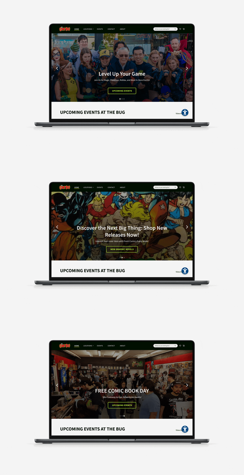
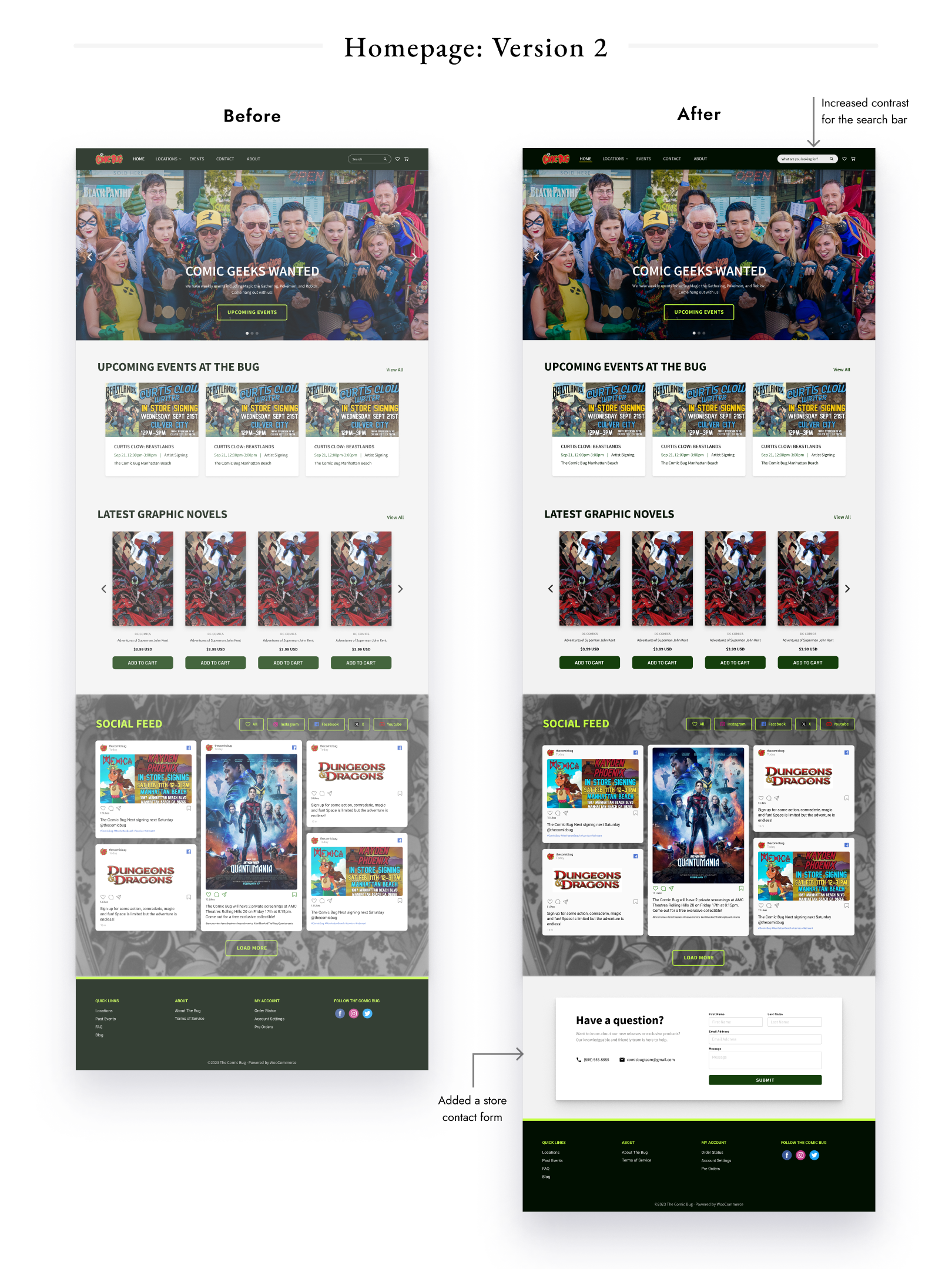
Due to changing expectations, I decided to focus my energy on pages and features that yielded the most impact. I created a redesigned homepage, crafting a modern and thoughtful design that highlighted the business’s main offerings. In addition to the design, I compiled web widgets – like a social media feed and accessibility tool– to drive customer engagement and enhance the website’s functionality.
Addressing Limitations
In the process of defining the project scope, I had to keep in mind various constraints. Addressing these constraints helped me to allocate enough bandwidth to better-define the problems, allowing me to design and iterate on a few key pages for the website. As there were few constraints in the design’s appearance and style, I was given full-reign to explore several design options. The project was primarily influenced by two major constraints:
- Resource Limitations: Given the limited time available with stakeholders and finite resources, I was compelled to make certain assumptions about user interactions.
- Technical Constraints: The website was required to support legacy posts and future e-commerce functionality, necessitating a platform that could accommodate this.
“How May We” Statements
I also formulated “how may we” statements based on stakeholder discussions, which helped to drive the direction of the project.
- How may we redesign the website without disrupting legacy posts?
- How can we enhance customer service on the homepage to drive brand loyalty and engagement?
- How may we utilize visually appealing elements to engage with customers?
Brainstorming Key Features
Collecting Customer Feedback
In order to gain an understanding of the customers, I conducted an in-store survey to gauge their perceptions and expectations. The feedback demonstrated a common sentiment - the website appeared “outdated” and lacked the feel of a business website. Additionally, customers expressed a need for more general information and suggested an FAQ page to streamline their communication with the business. Customers expressed confusion as to what information they could gain from the website, citing an unclear site navigation.
Leveraging Customer Data To Build A Persona
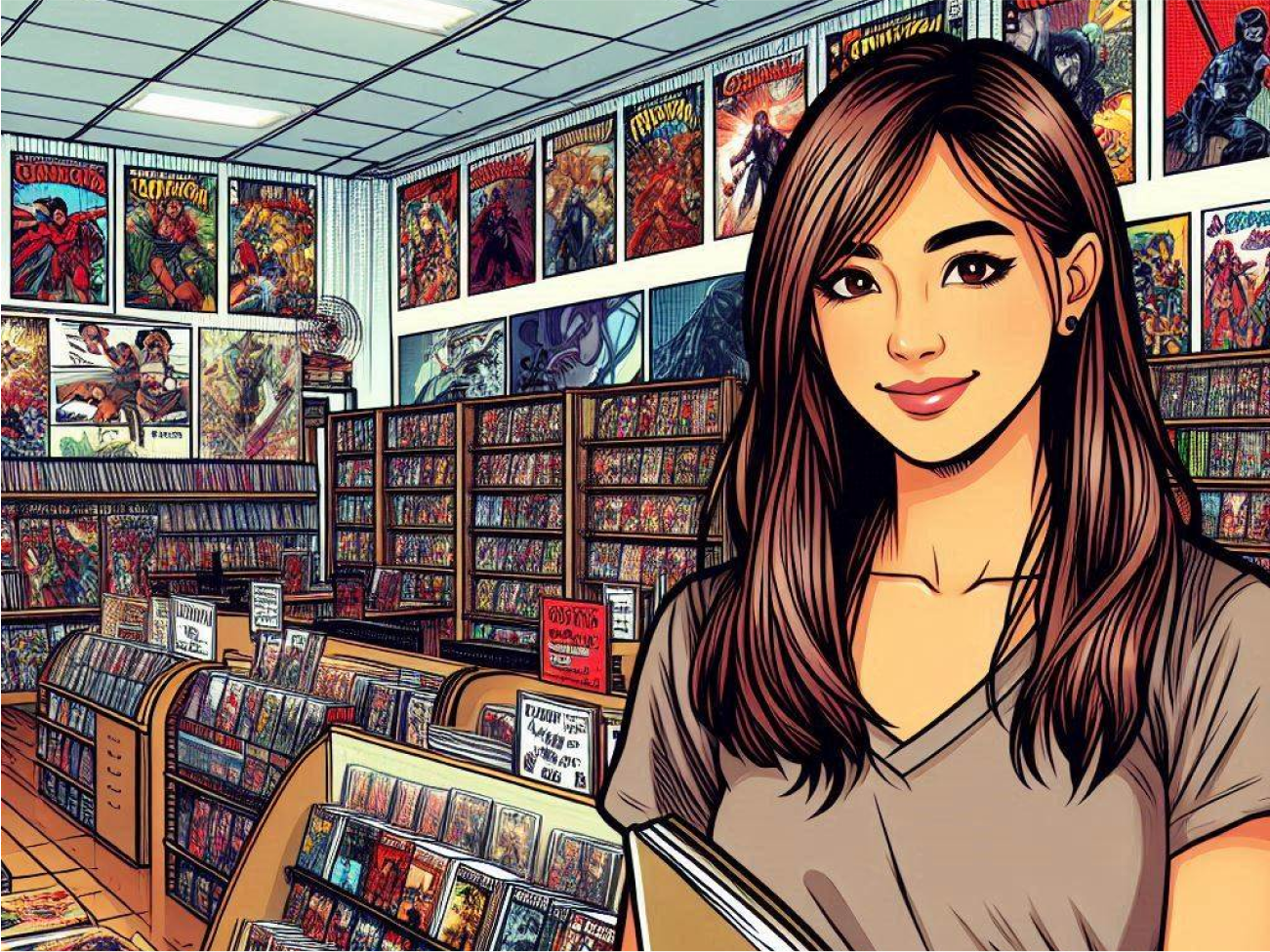
While balancing stakeholder expectations and navigating changes in project scope, it was challenging to keep the ultimate goal in sight - designing for The Comic Bug customer. To stay aligned with the project objectives, I prioritized the website’s features through the lens of my created persona, Paul, who served as a reminder of the user’s core needs.
Paul is a man in his forties who lives locally. He leads a busy life as an auto mechanic and visits the comic book store to unwind after a hectic day. He is interested in attending store events with his son, who is gaining an interest in comics.
Goals:
- Stay updated on new comic book releases
- Learn about events he can attend with his family
Pains:
- Lack of awareness about upcoming store events
- Not knowing what products are in stock
Motivations:
- Stay informed of new comics that he might like
- Share his comic book passion with his son
Comparative Analysis
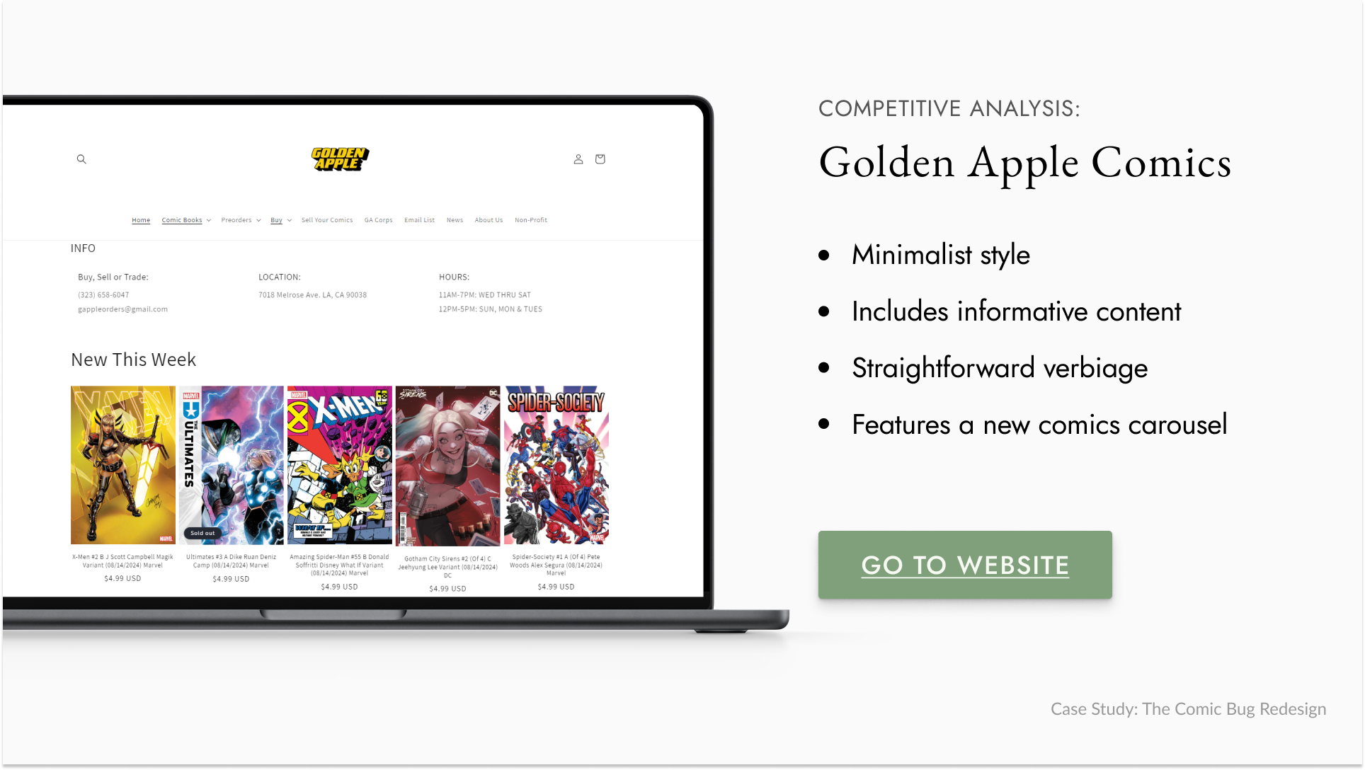
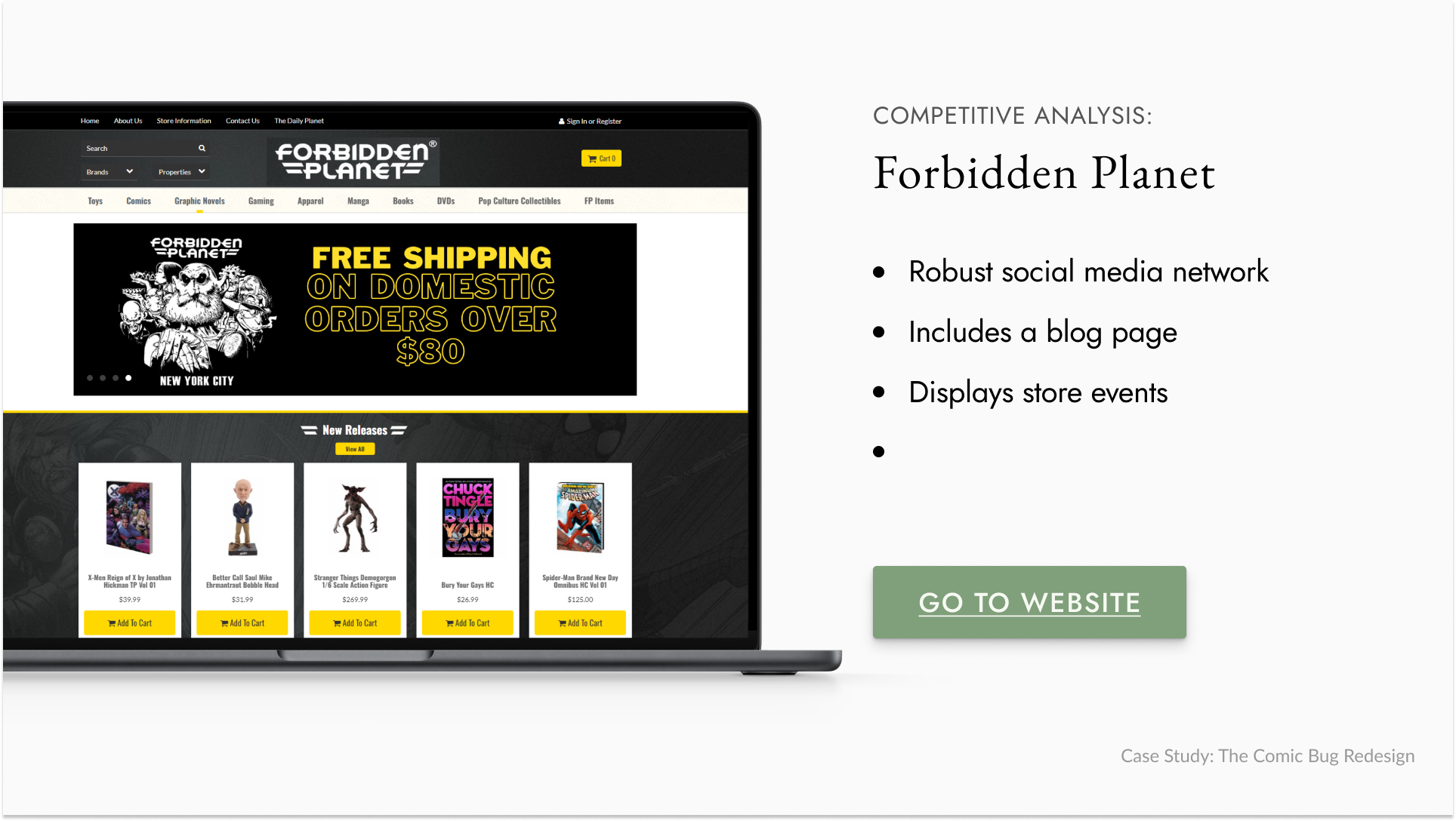
I analyzed other comic book stores’ websites and event sites to understand industry-specific layouts and verbiage. This revealed the need for an engaging homepage with visually appealing elements and social media integration.
Some, like Third Eye Comics, appealed visually to the user with their high-contrast images and bold text and colors. In Contrast, Golden Apple Comics features a minimalist and simple layout. Large companies, like Forbidden Planet, featured lots of information about the store, events, and a blog.
Mapping Out Key Features
Gathering the data I collected from customers and stakeholders, I mapped out each feature as how it would relate to each “how may we” statement.
Prioritizing Key Features
I listed the features and used an impact-effort matrix to prioritize them based on their impact relative to the effort required. Effort was measured by the relative bandwidth needed to complete each feature, while impact was assessed by how well the feature met stakeholder needs.
I also considered project constraints to determine which features were feasible. I focused on features that were both feasible and had a high impact. Low-effort, low-impact features were included because they complemented higher-impact ones. For example, adding social media icons enhanced the social media feed on the homepage, supporting the goal of increasing social media presence. Due to project limitations, I focused on designing features that related to “How May We” statements 1 and 2, or features that help modernize and enhance customer service.

Starting the Design Work
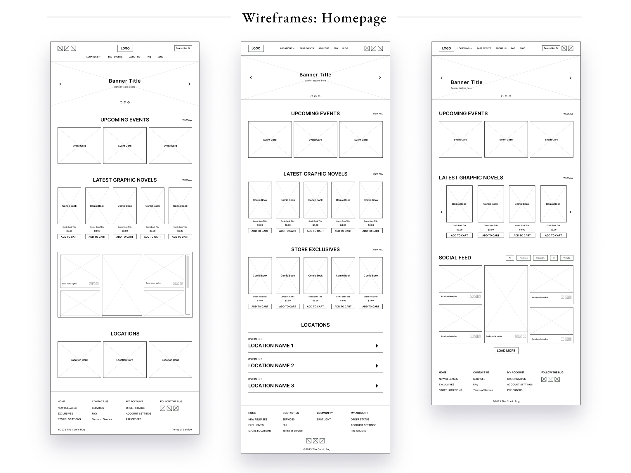
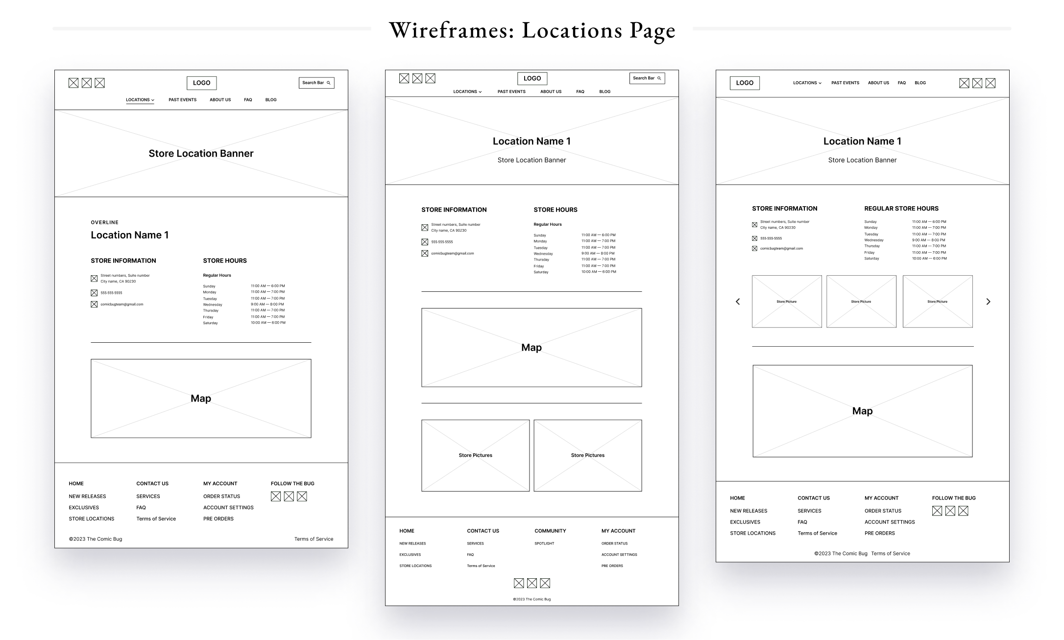
Low-fidelity Wireframes
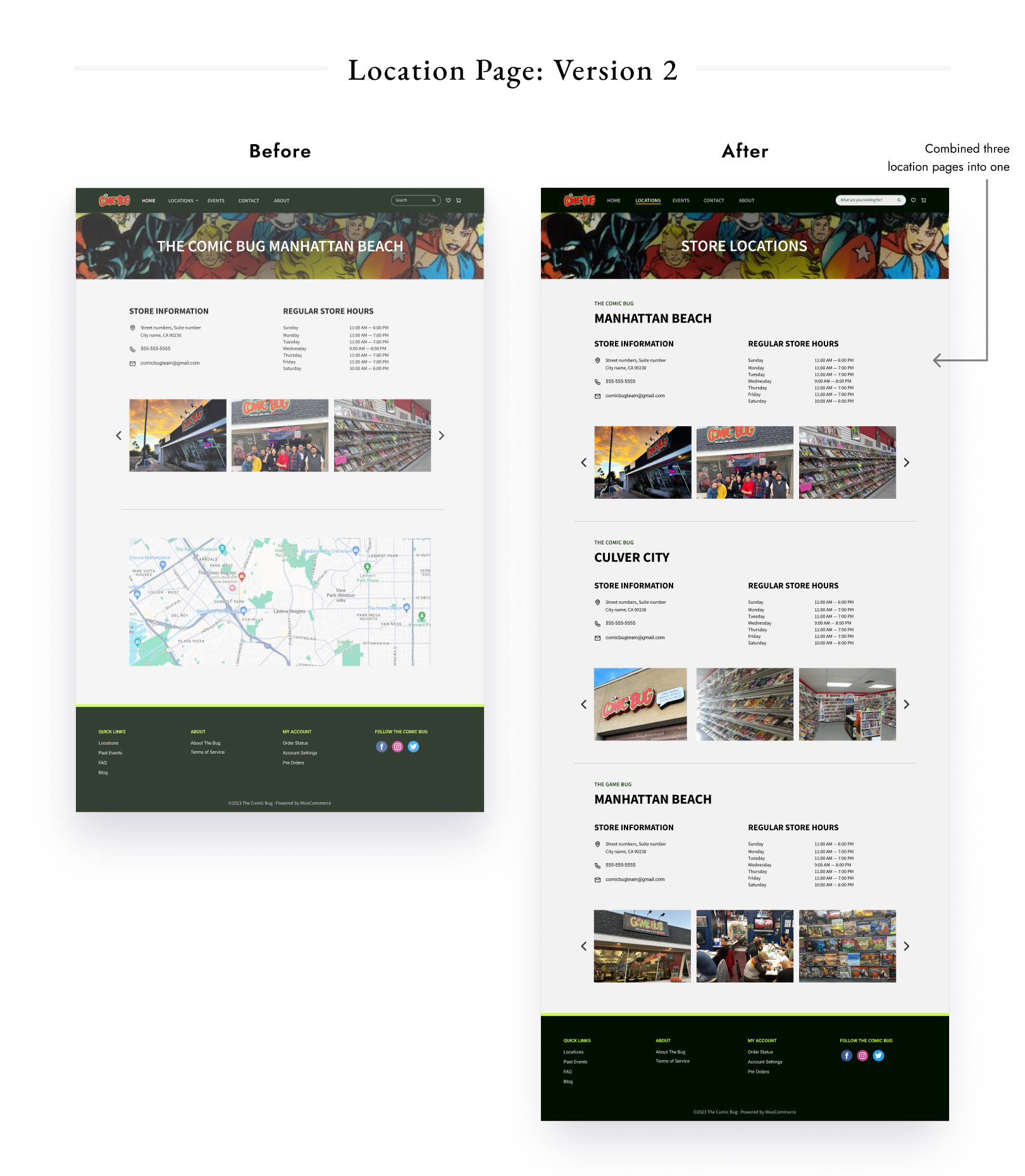
The initial designs focused on key-elements, which included a hero banner, events carousel, and a social media feed. I explored different ways of presenting the store contact information. In the store location pages, I aimed to include all pertinent information for the customer, such as contact info and a map, as well as store images to illustrate the character of the business.
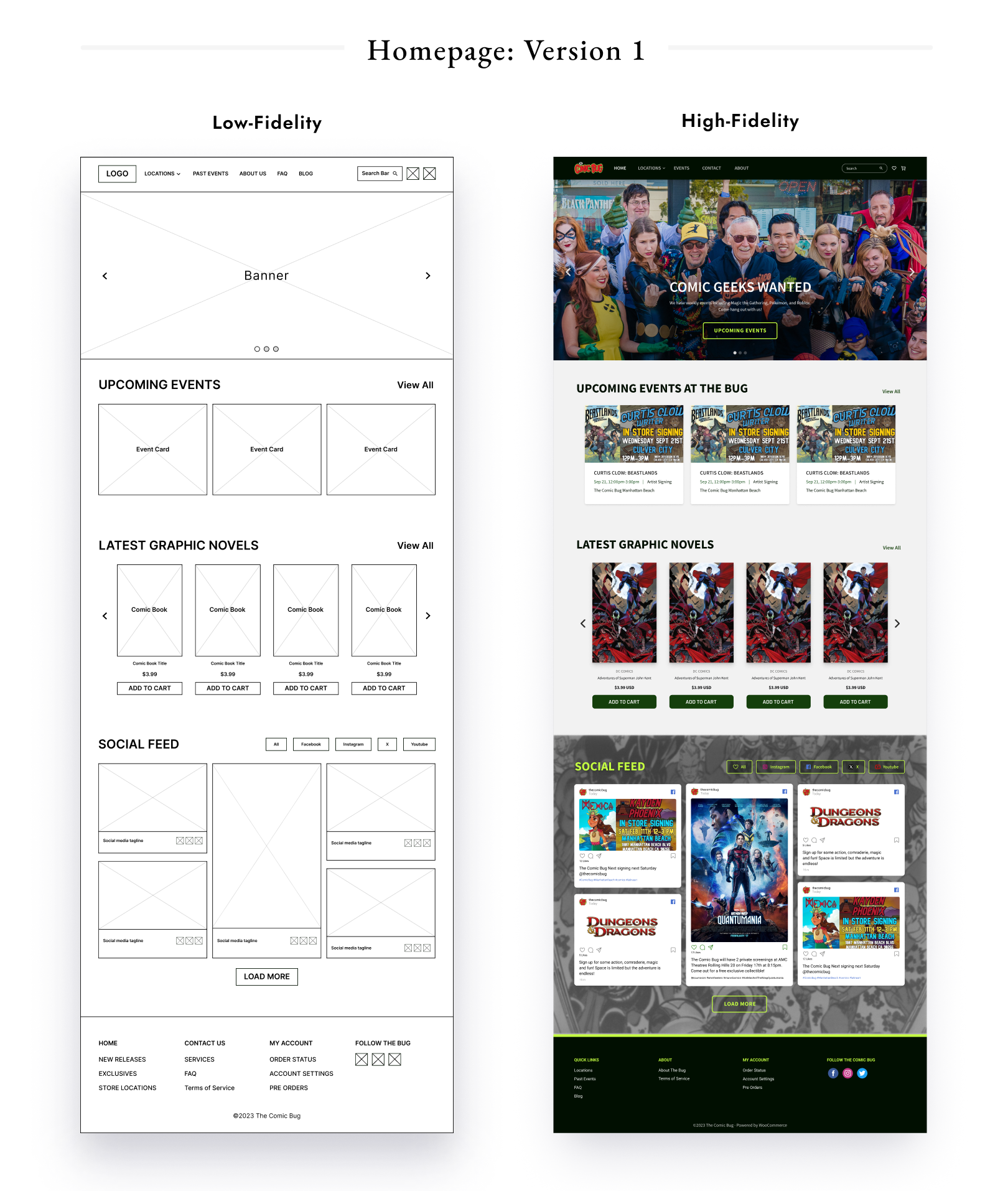
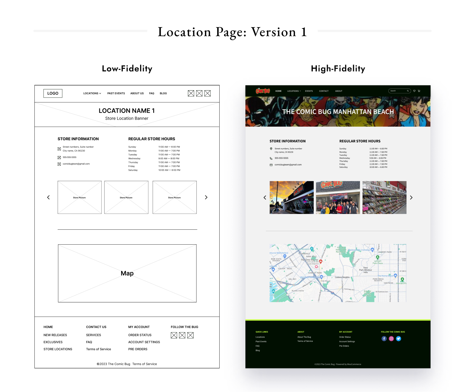
High-Fidelity Wireframes
Once I ran the designs with the owner, I created high-fidelity mockups, with a focus on creating a concise typographic hierarchy and color scheme.
Usability Studies
Usability Studies
I conducted usability tests with three participants, where I measured how effectively I addressed the “how may we” statements introduced earlier. When comparing the home and location pages before and after redesign, the usability studies revealed a significant increase in user satisfaction and user-friendliness.
+65%
Appearance/Style
+33%
User-friendliness
+75%
User satisfaction
Enacting Changes
When I asked participants how we could improve customer service, one user suggested adding a question form. Another participant suggested we could increase usability by adding more contrast the colors in the search bar, as well as a better way of signaling what page the user is on. User feedback led to revisions in the final mockups.
Consolidating The Location Pages
Overall, one user stated the location page was easy to navigate and also stated the layout looks “modern and what [they are] used to seeing”. However, they expressed concern regarding the separate location pages, stating it was “tedious going back and forth” between multiple location pages and suggested they be consolidated into one.
Handoff and Recommendations
I handed off the final designs to the stakeholder, along with recommendations for future implementation. These included clear explanations of services and store policies on the FAQ page, a guideline on creating banners, installing WordPress’s e-commerce shop, and embedding social media feeds on the homepage.
Key Takeaways
This project underscored the importance of maintaining a delicate balance between stakeholder expectations and project constraints. It was imperative to regularly seek stakeholder feedback to stay on top of evolving expectations. The experience highlighted the power of effective communication with a diverse group of stakeholders, and the importance of asking probing questions. Lastly, the project reinforced the necessity of dedicating ample time to developing wireframes, to ensure a consistent and well-thought-out design.
Thank you for reading my case study.
