Improving Project Review Workflows in the TDM Calculator for L.A. City Planning
Company: Hack for LA | Client: LACP and LADOT
Role
UI/UX Designer
Timeframe
4 weeks
Tools
Figma
GitHub
Status
MVP in development
PROJECT PROBLEM
City planners expressed a need to update internal notes without disrupting their workflow
To support the internal review process at LACP, our team introduced an Admin Notes feature that allowed staff to add and manage notes directly from the Projects page. This streamlined project tracking by removing the need to navigate away from their workflow. We framed our design challenge with a focused question:
"How might we let users add and edit notes without leaving the Projects page, while preserving space in a dense data table?"

USABILITY STUDIES
Early testing uncovered layout issues, unclear interactions, and low discoverability
The original in-line editing created layout issues and made it harder for users to interact confidently with the notes. Feedback from usability testing showed users needed clearer interaction cues, a cleaner layout, and better safeguards against data loss
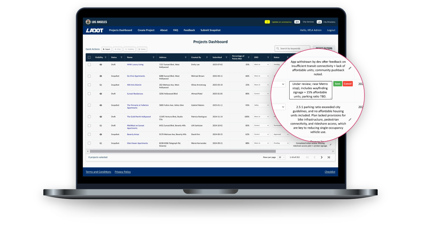
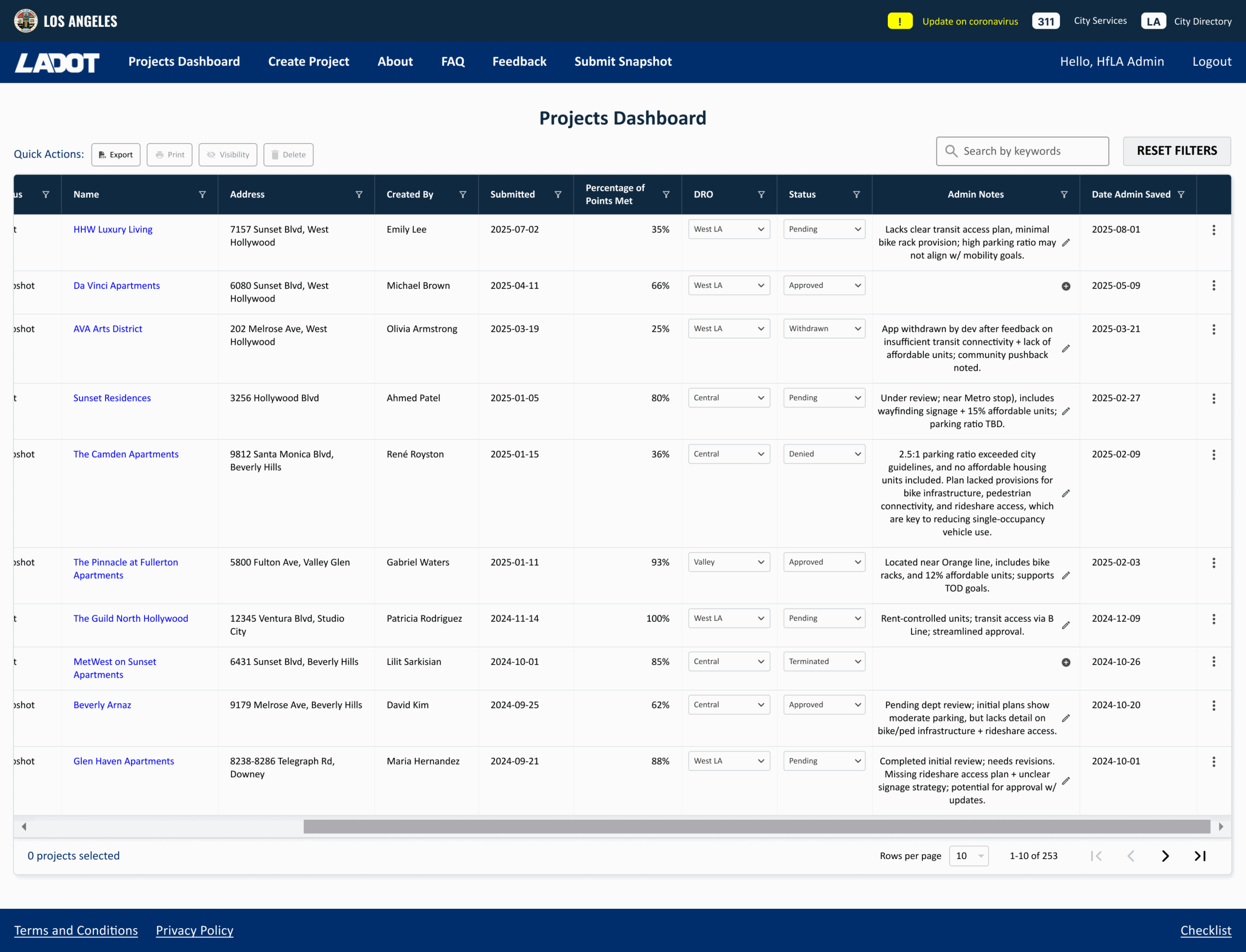
The first version of the feature let users click a pencil icon to edit notes directly in the data table. This seemed efficient at first, but it quickly became clear that it wasn’t ideal. The notes column was too wide, which broke the alignment of the table. Showing full text for each note made the interface feel cluttered and harder to scan. Based on usability tests with 3 users, we noticed they also weren’t sure how to save their edits or even where to click to begin editing. I conducted usability testing with 3 users on the initial implementation to better understand user needs. Common themes emerged:
- Users liked not having to leave the page, but the wide notes column made it harder to scan the table
- Several participants suggested using icons, tooltips, or modals instead of displaying full notes inline
- Some users didn’t realize they could click to add or edit a note
This feedback highlighted the importance of discoverability, visual clarity, and interaction safeguards in the redesign.
MOCKUP
Through 2 iterations, we used truncated text, tooltips, rich text editing, and a modal to reduce clutter and improve clarity
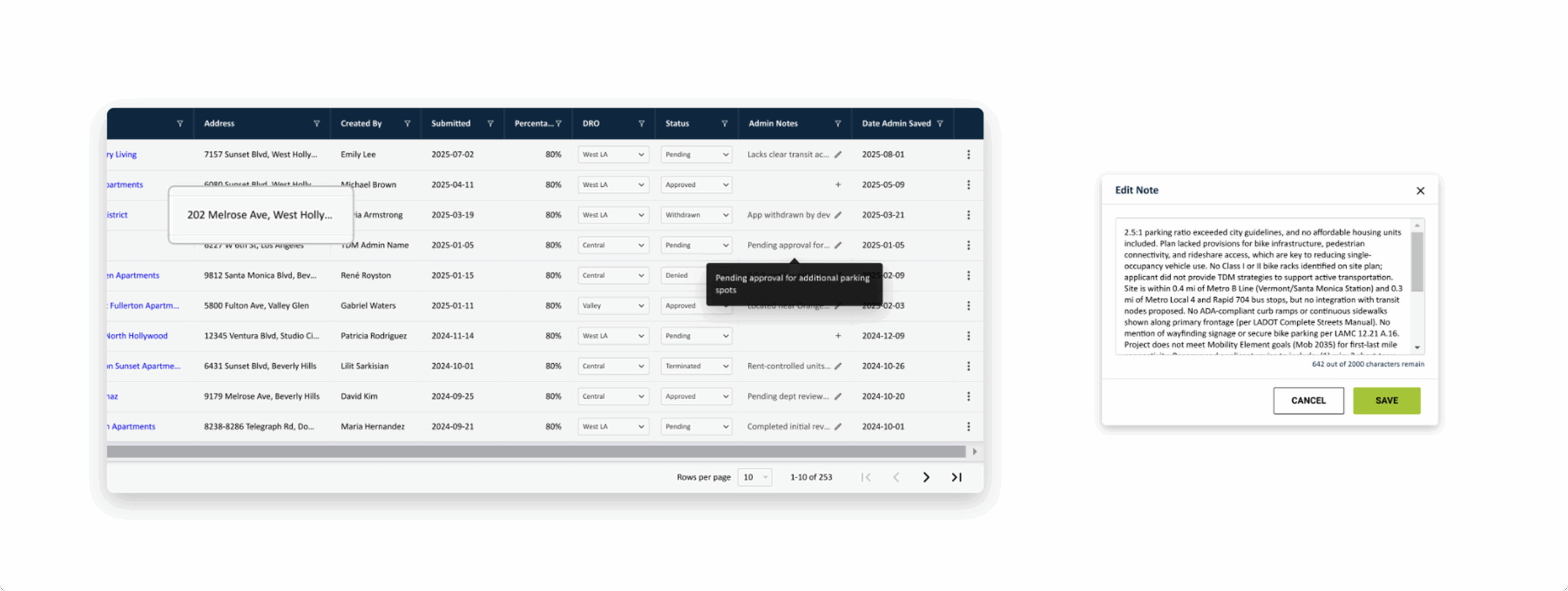
In the first iteration, we replaced the original in-line editing with a dedicated modal to reduce visual clutter and improve readability. Notes appeared as truncated text with ellipses, while hover tooltips provided quick previews without expanding the table. To support easy scanning, we introduced status icons: a plus sign for new notes and a notepad icon for existing ones.
Following stakeholder input, we expanded functionality in the second iteration by adding an HTML text editor, removing the character limit, and enabling users to resize the input field. These updates were built using existing product patterns to ensure a consistent and familiar user experience. To prevent users from accidentally losing their notes, we added an exit-intent confirmation modal. I collaborated with another designer to ensure the modal’s interaction, layout, and copy aligned with platform-wide modal behavior.

RESULTS
The redesigned Admin Notes feature reduced clutter, improved scannability, and eliminated horizontal scrolling on the Projects dashboard
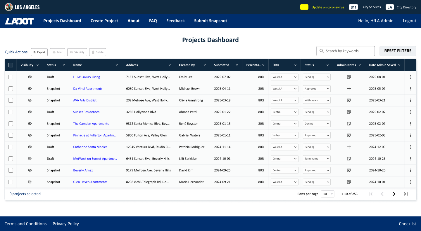
As part of the final solution, I replaced full-text note displays with icon-based triggers and introduced truncated text with hover previews. This redesign reduced the overall table width by 10.27%, supporting the team's efforts in organizing the column tables. These changes eliminated the need for horizontal scrolling, and creating a more compact and legible layout without sacrificing functionality. The new design also enhanced consistency across interactions, making it easier for users to recognize and engage with note-related actions. I also provided additional components that matched teh design system.


Side-by-side comparison of the first and final versions.
LESSONS LEARNED
In this project, I learned the important of early alignment with stakeholders, and reusing existing patterns to deliver faster results
Looking back, aligning earlier with stakeholders could have helped us avoid rework and reduce friction in decision-making. Asking targeted questions early on — like whether notes should support formatting or unlimited characters — would’ve saved valuable time. One of the most effective decisions we made was to lean on existing product patterns. It helped speed up implementation and kept the user experience cohesive.
Next steps include testing the live version with users to evaluate its functionality and identify areas for improvement.