Making Auto UI Design More Accessible for the Figma Community
Personal Project: Tesla Model 3 UI Component Library
Project Details
Type: Personal Project
Tools: Figma
Role: UX/UI Designer
Timeline: 12 weeks, including design and file organization
Collaboration: Referenced existing Figma Community files and reached out to contributors for feedback on organization best practices.
Project Context
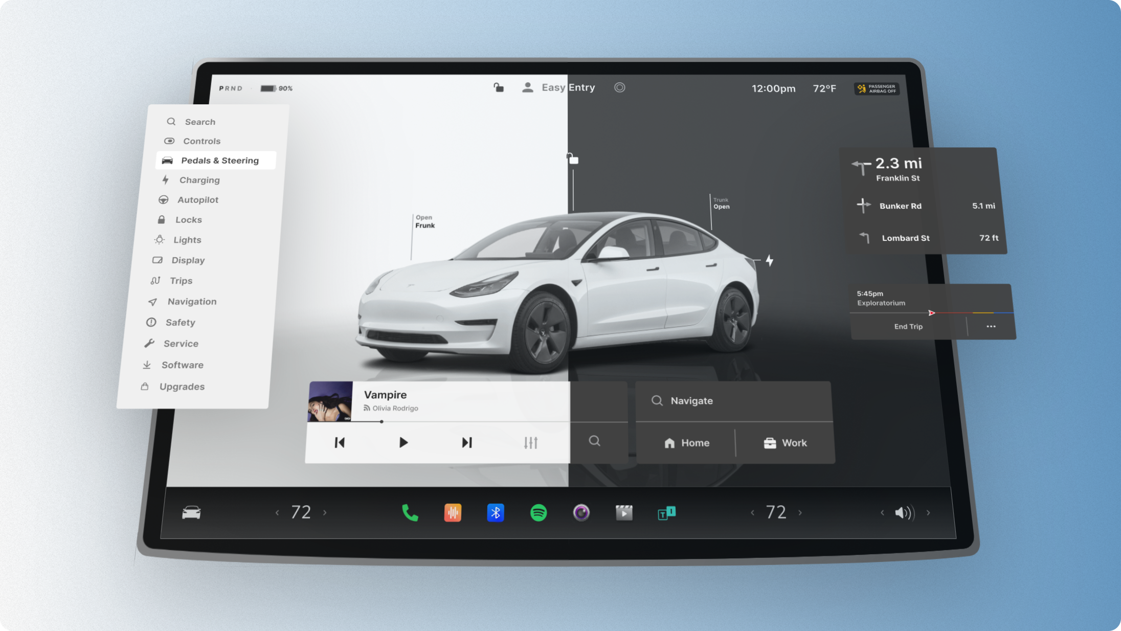
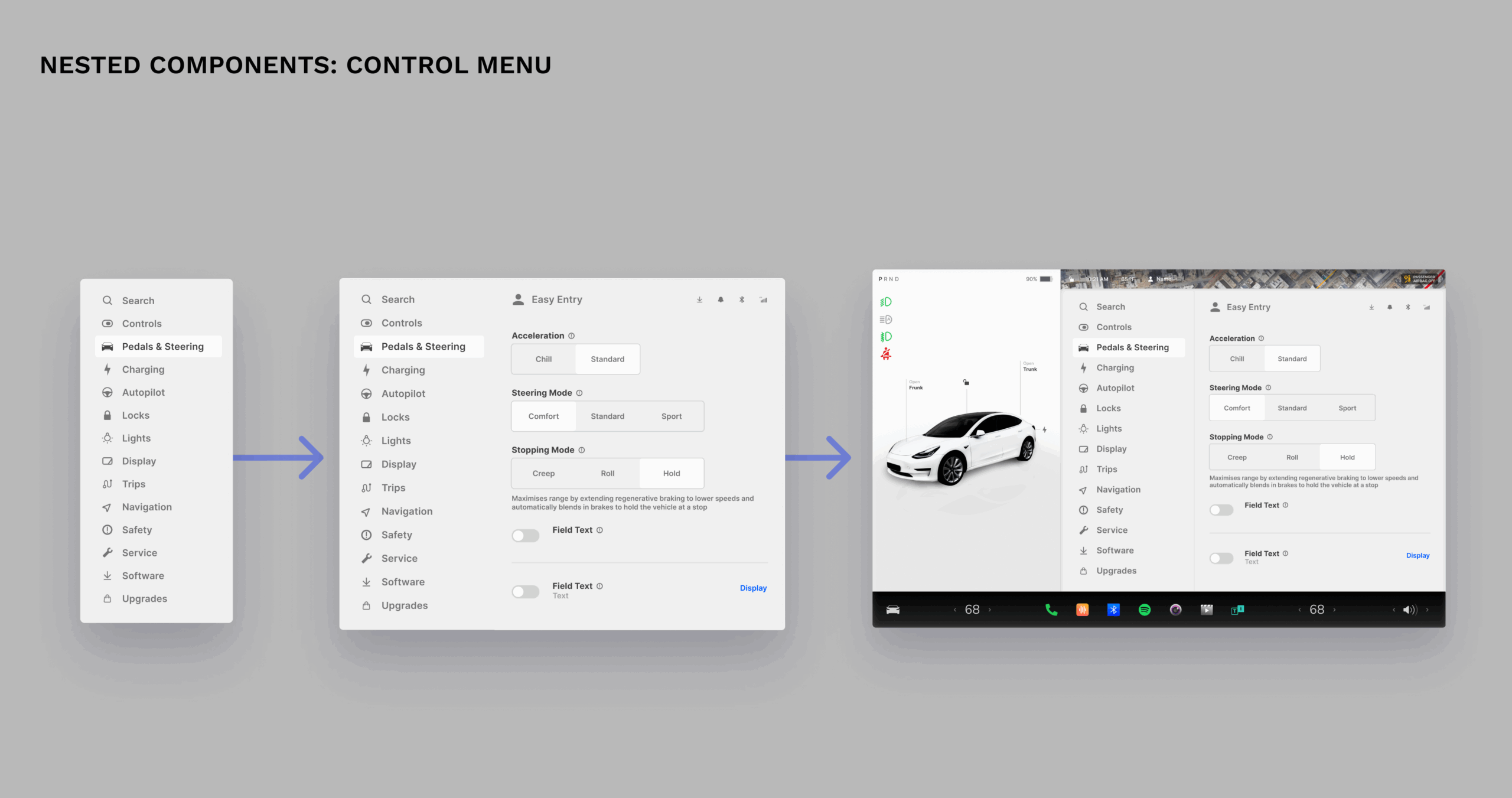
This Tesla Model 3-inspired UI component library was a personal exploration into touchscreen design and a way to contribute to the design community. After noticing that most Tesla UI kits were outdated or inflexible, I set out to build a cleaner, more modular, and realistic alternative. Designed in Figma using atomic design principles, the library includes pixel-perfect components, light and dark modes, and over 20 original icons. My goal was to create a system that helps other UI designers prototype dashboards and infotainment systems more efficiently.
What’s Inside
- 6+ navigation components
- Music bar (expanded & collapsed)
- Touchscreen menu with 5 tabs (sliders, toggles, brightness controls)
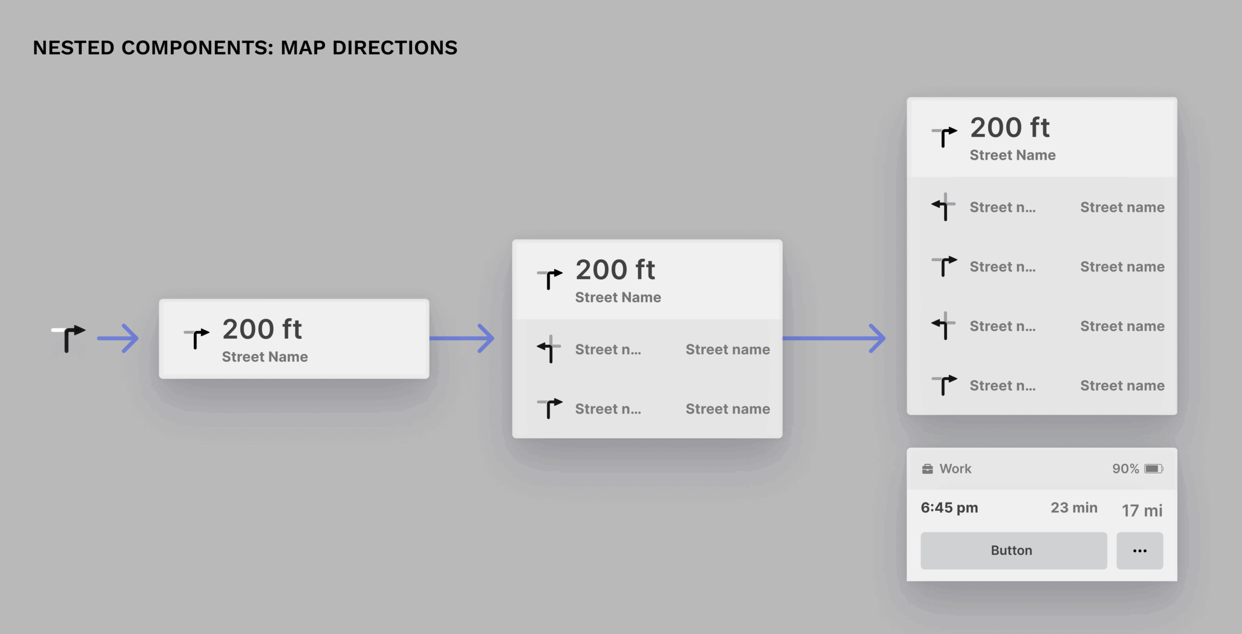
- Quick actions toolbar, map, nav tree
- 3 car status views (parked, reverse, driving)
- 20+ custom app icons (camera, energy, calendar, etc.)
- Light/dark mode with accent colors for notifications
- Optimized structure for easy editing and swapping
Impact
- Published on Figma Community
- 4,000+ views
- 62% usage rate
This project helped me improve my file organization, naming conventions, and component logic for public use. I’m continuing to refine the file and welcome feedback, critiques, or collaboration opportunities.
Nami Goeku
© 2026 · Orange County, CA