Streamlining Onboarding for a Growing Tech-For-Good Community
Dev Launchers connects early-stage product teams with nonprofit organizations. Ahead of a $10,000 marketing campaign, the organization needed to improve its inconsistent onboarding experience and collect member data to better personalize the platform based on users' roles.
ROLE
UI/UX Designer (1 of 2 designers)
TEAM
Product Lead, 2 React Developers, 2 UX Researchers, 2 UI Designers
TIMELINE
8 weeks (ideation → design → testing → handoff)
MY FOCUS
Content Strategy, Value Proposition Framework, Interactive Prototyping, Usability Testing
PROJECT SUMMARY
Dev Launchers is a social hub connecting volunteers with nonprofits, and the platform struggled with user retention.
Dev Launchers is an organization that helps partner early-stage product teams with nonprofit organizations. I worked on the user onboarding flow to address members' complaints of inconsistent onboarding experiences. This was a product-driven project with the aims of not only streamlining onboarding new hires but also collecting member data to build a stronger platform that caters to their needs.
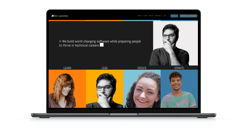
Dev Launchers' existing homepage showing the four user pathways: Learn, Lead, Create, and Donate
MY ROLE & APPROACH
I led content strategy and research frameworks while designing the user flow, creating mockups, and conducting usability testing.
My work spanned the full design process:
Led strategic research. I created a Value Proposition Matrix and Impact-Effort Matrix through stakeholder interviews and competitive research, helping define product direction despite unclear business goals.
Facilitated brainstorming sessions. I held meetings with senior members to define organizational focus and determine which features would be included in the MVP based on necessity and technical feasibility.
Designed the user flow and interface. I created the user journey, wireframes, and four iterations of mockups for account setup, product tour, modals, and profile dashboard—all validated through concurrent usability testing.
Collaborated cross-functionally. I worked with the design system team to create reusable components, particularly a multi-step progress bar for complex tasks.
PROCESS: ALIGNING PRODUCT WITH EVOLVING BUSINESS GOALS
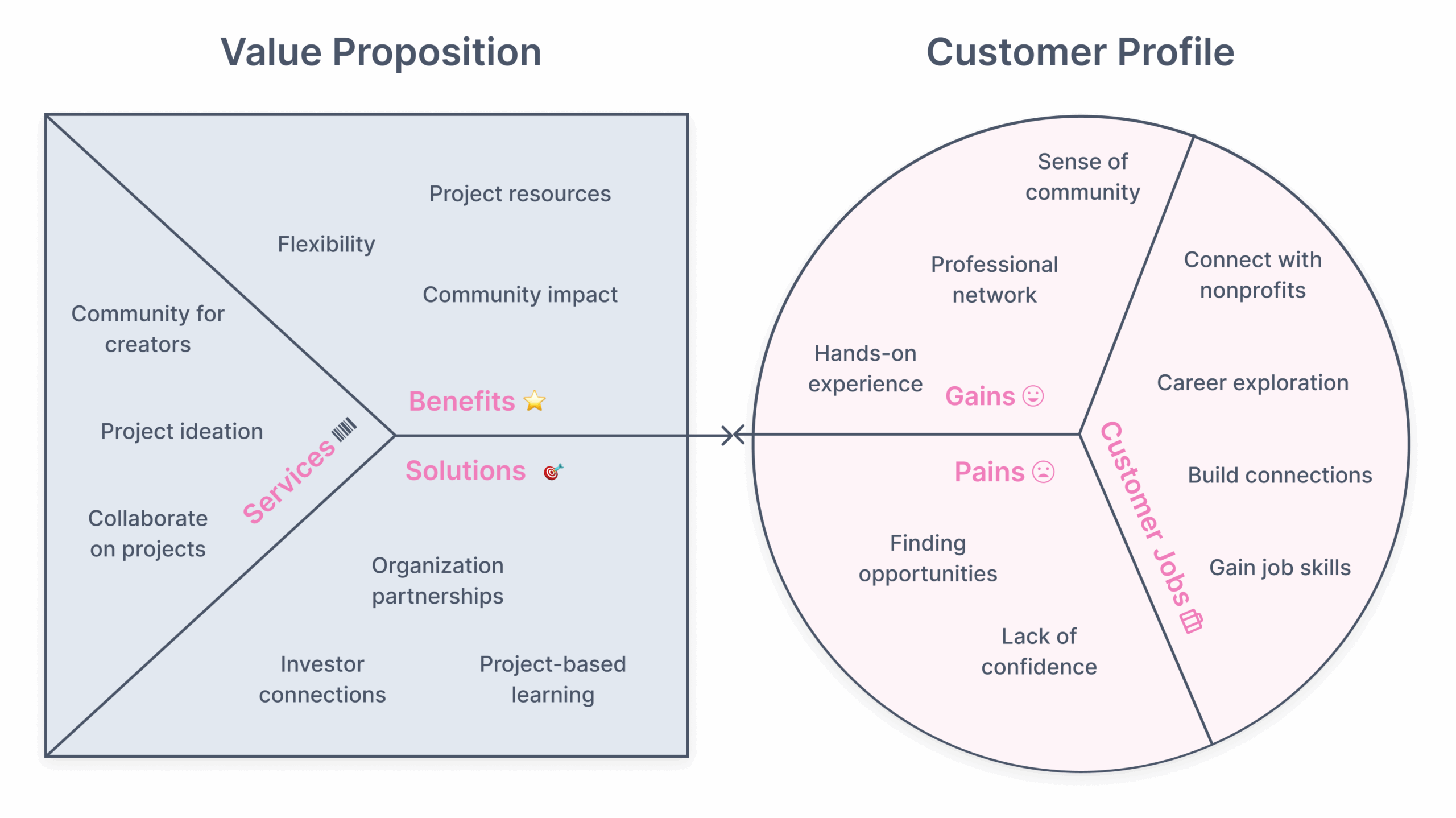
I created a Value Proposition Matrix to understand users and align features with stakeholder vision.
Because the organization was going through a business refocus, we wanted to align the product with the stakeholders’ envisioned business goals. We compiled a framework to understand the customer profile, conceptualize the goals they want to reach, and identify the solutions Dev Launchers has to offer.
We conducted user and stakeholder interviews, as well as secondary research into similar platforms, to put together the value proposition matrix. The result was that we used the value proposition matrix to determine the direction of the company and establish features for the new onboarding product. We used the value proposition matrix to establish Dev Launchers’ business goals and solutions to customer pain points.
PRIORITIZING FEATURES THROUGH RESEARCH
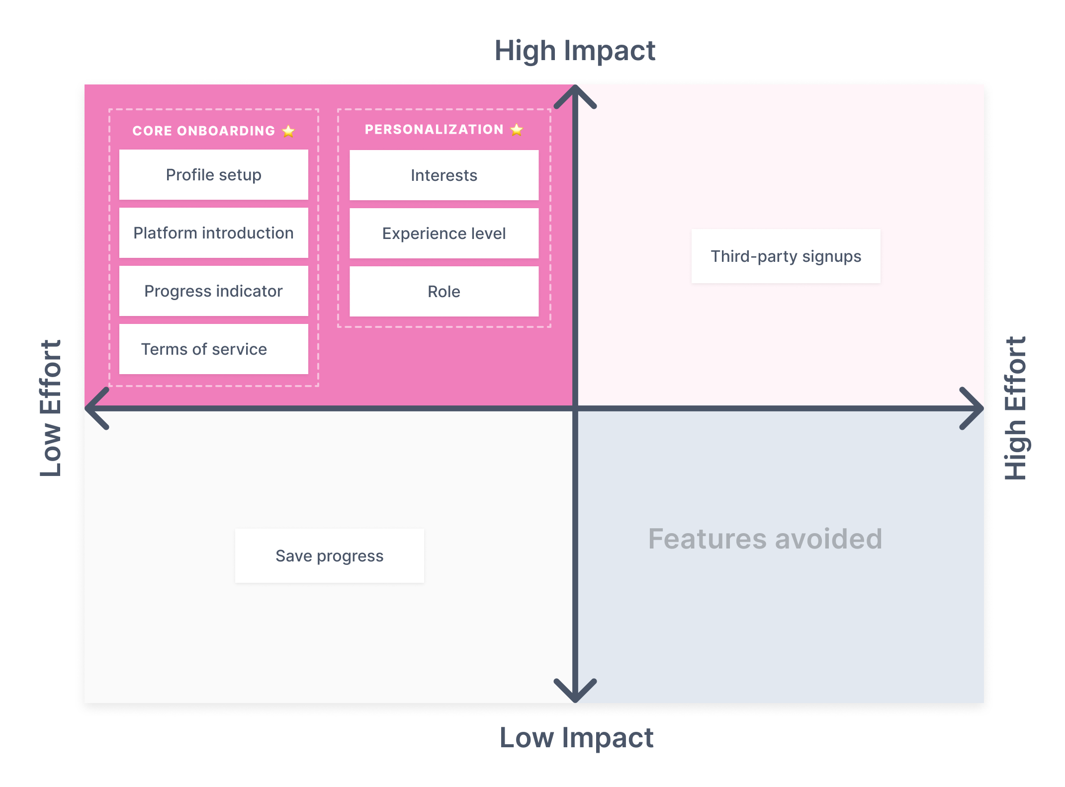
I then researched similar social platforms to compile potential features and prioritized them using an Impact-Effort Matrix
I researched social platforms with similar value propositions—particularly education-focused networks like Hashnode and Stack Exchange—to understand how onboarding educates users and collects data for personalization.
Using insights from the Value Proposition Matrix, I identified where user needs and platform offerings overlapped, defining 13 proposed features for the onboarding flow. I then mapped these in an Impact-Effort Matrix, ordering them by implementation difficulty and impact on user goals.
DESIGN ITERATIONS
Across four iterations
ITERATION 1
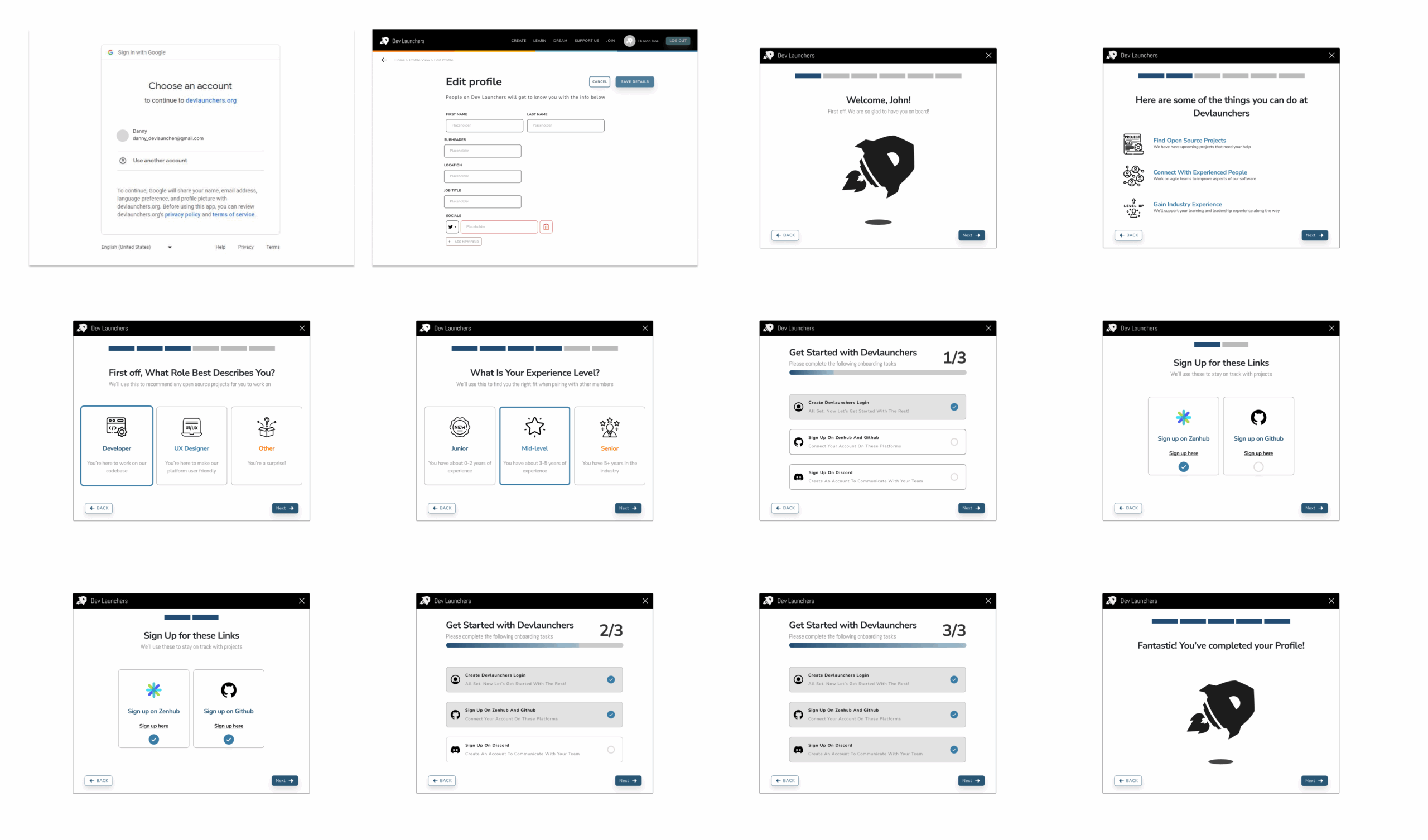
First mockups included email signup, profile setup, organization info, and user questions. Testing revealed confusion with dual progress bars and mandatory third-party signups.
ITERATION 2
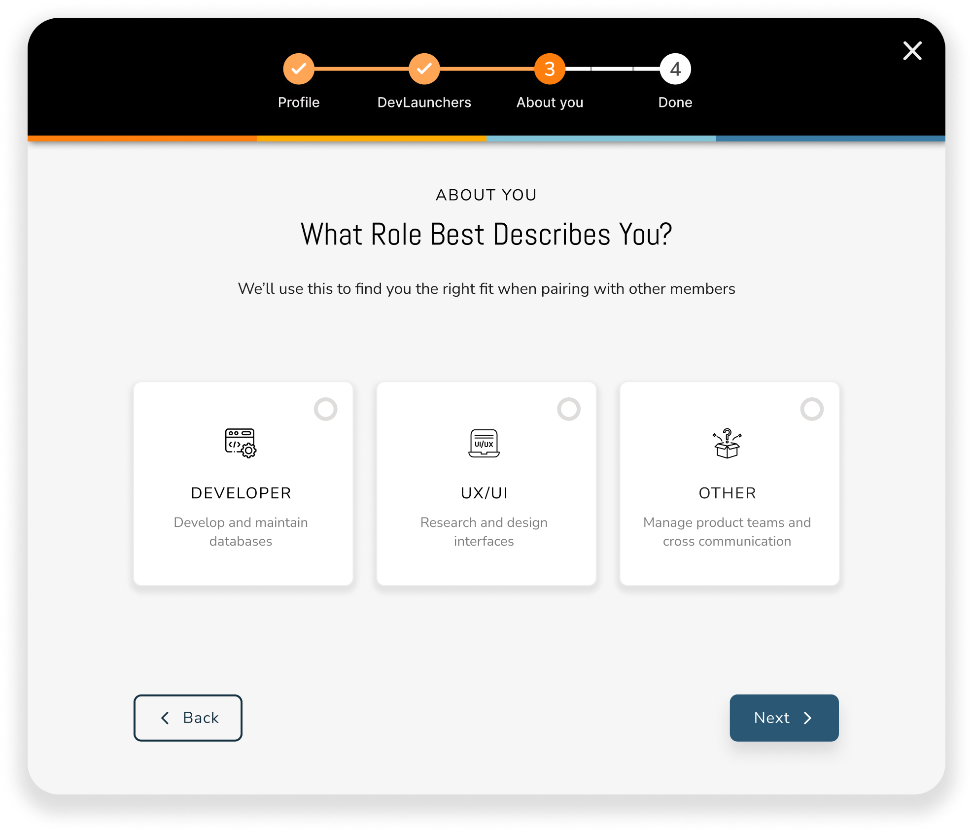
Refined verbiage about platform purpose and signup requirements. Made third-party accounts optional to reduce friction.
ITERATION 3
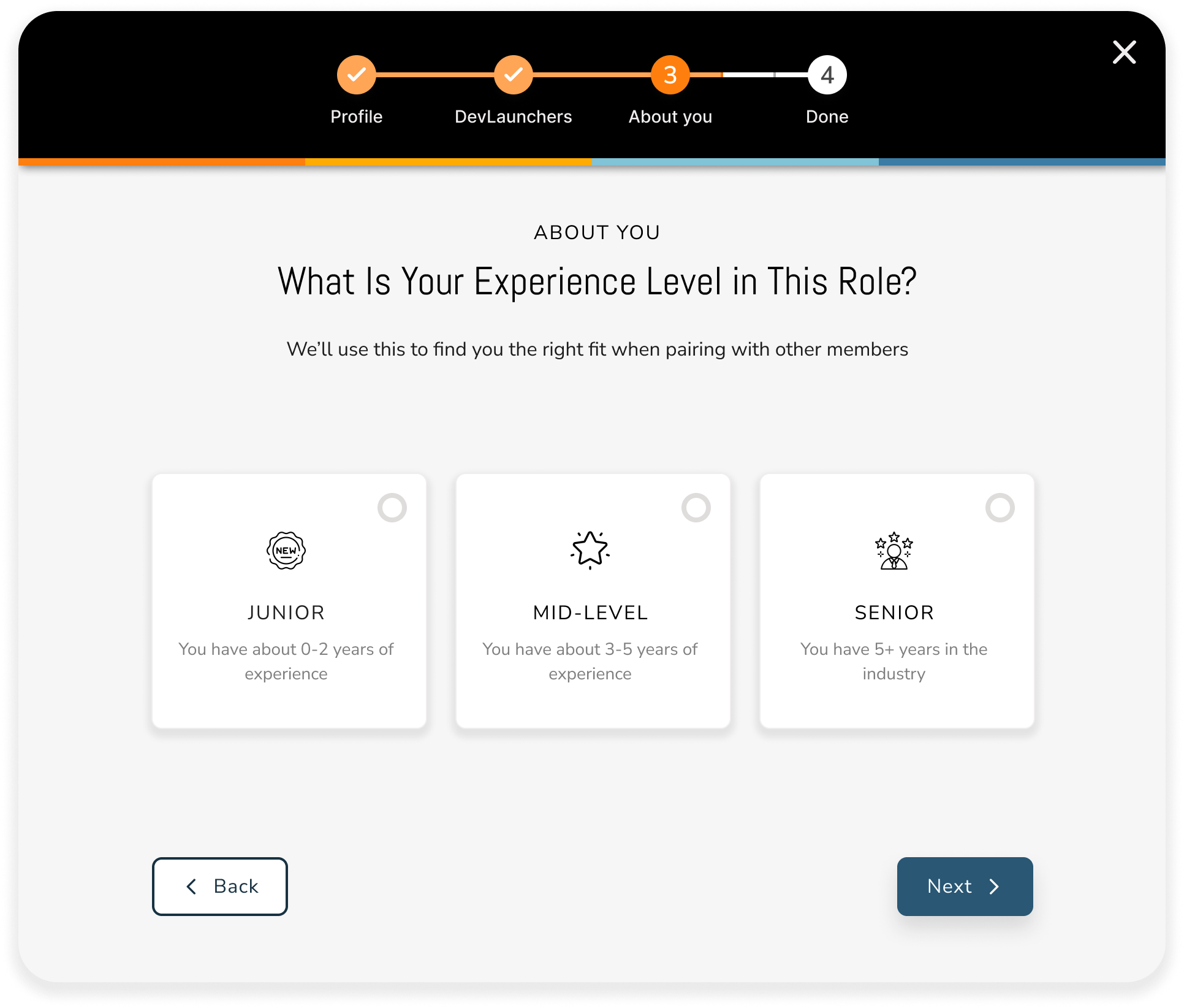
Consolidated dual progress bars into one cohesive component, creating less confusion about onboarding steps.
ITERATION 4
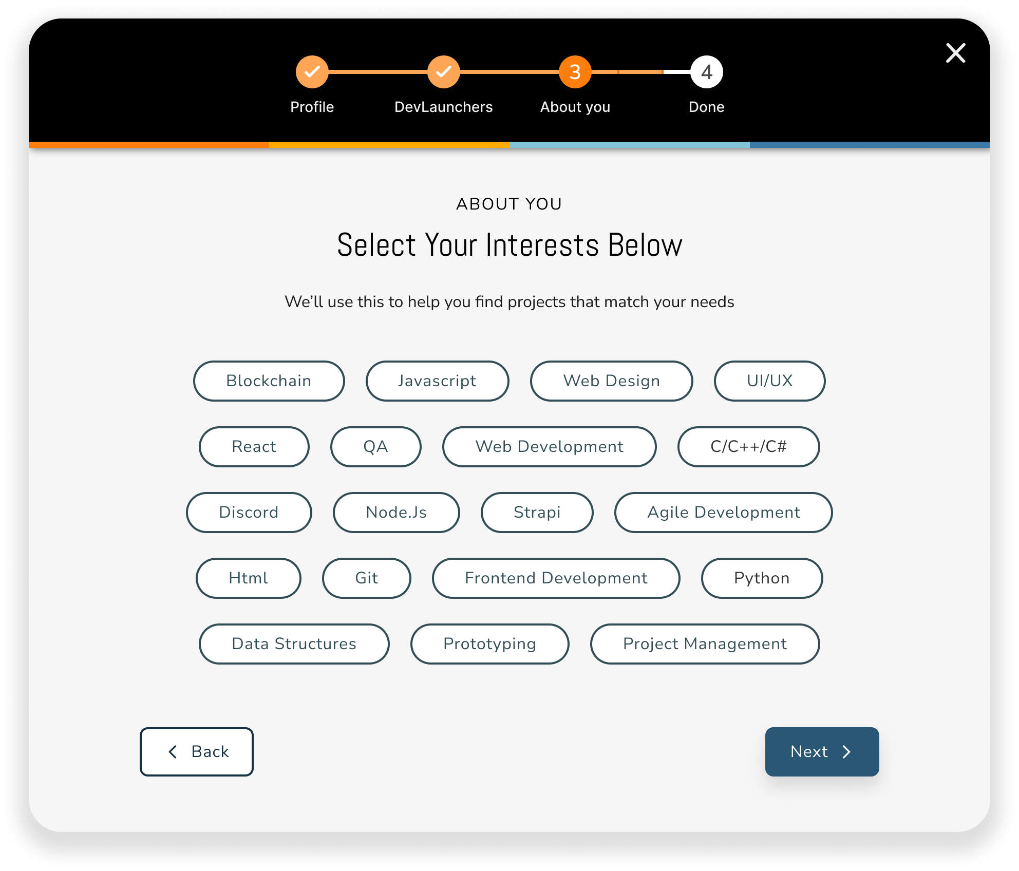
Added 32 interest categories for personalization and warning modal to prevent accidental progress loss, improving engagement and retention.
FINAL OUTCOMES
The launch of the core onboarding features led to a 150% increase in page views
We successfully launched the onboarding flow and user profile with measurable results:
150%
Increase in page views
4.8%
Decrease in bounce rate
54%
Improvement in perceived simplicity
LESSONS LEARNED
As Dev Launchers refocused its mission, our onboarding design laid the groundwork for scalable personalization and long-term user engagement
Strategic frameworks drive clarity in ambiguous situations. Creating the Value Proposition and Impact-Effort Matrices when business goals were undefined helped align stakeholders and prioritize features, turning ambiguity into actionable direction.
Facilitated brainstorming sessions. I held meetings with senior members to define organizational focus and determine which features would be included in the MVP based on necessity and technical feasibility.
Concurrent research and design validates faster. Running usability studies between design iterations let us validate solutions as we built them, meeting both business and user requirements without costly post-launch revisions.
Content strategy shapes experience as much as visual design. Clarifying messaging about platform purpose and signup requirements directly addressed user confusion and improved completion rates—words matter as much as interfaces.