Case study · 2024 · Civic tech · Hack for LA
An admin-notes system for city reviewers, inside an already-dense table.
Moving note-taking off a 15-column review table and into a focused, error-resistant dialog flow that is more discoverable, more forgiving, and compact enough to survive the columns still being added.
Platform
TDM Calculator, built by Hack for LA in partnership with LADOT and LACP
Timeline
5 weeks
(October–November 2024)
ROLE
Sole designer · research, interaction, handoff
Team
Cross-functional team of 7 (2 design leads, 3 developers, 1 project lead)
Tools
Figma · GitHub · React
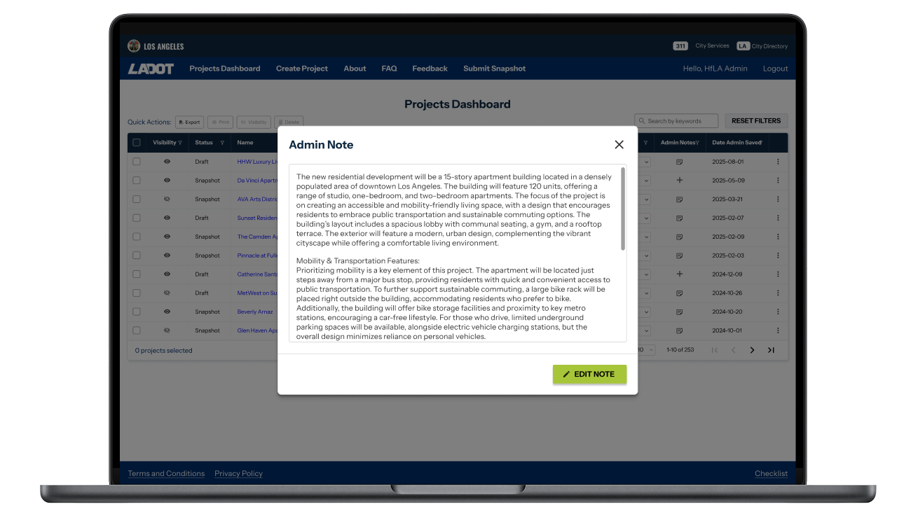
The end-result: a dialog solution that maintains space and reduces error
TL;DR
LACP reviewers annotate developer submissions inside the Projects table. The original pencil-icon, in-cell editor offered no clear way to add or save a note and cluttered an already-dense dashboard. I redesigned it across three iterations into a focused modal-dialog flow that is more discoverable, more error-resistant, and compact. The dialog was later adopted into the product's shared component library.
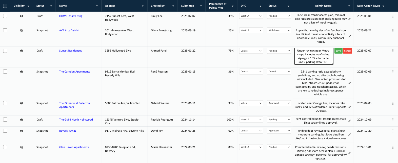
The Projects table, where Admin Notes live: 15 columns wide, with notes competing for space against every other review field.
Context
A civic tool with real scale behind it, and three stakeholder groups to align with before any design decision could move.
The Transportation Demand Management (TDM) Calculator is a web tool built by Hack for LA in partnership with Los Angeles Department of Transportation (LADOT) and Los Angeles City Planning (LACP), supporting land-use and multi-modal mobility decisions under LA's 2035 Mobility Plan. It informs review on an estimated 100,000 new housing units. Coordinating across three diverse stakeholder groups (LADOT, LACP, and Hack for LA leads) added organizational complexity beyond the tool's underlying scale, since each group held different priorities and required separate alignment before decisions could move forward.
I was the sole designer on the Admin Notes feature, working within a cross-functional team of 7 (two design leads, three developers, a project lead) over a 5-week sprint. I led research, design, and stakeholder alignment, using Figma for wireframes and prototypes, Github for documentation, and drawing on design libraries and UX resources to guide the work.
The Problem: Two failures at once
An in-cell pencil editor with no clear way to add or save a note, within a cramped table layout
Admin Notes gives LACP and LADOT reviewers an internal space to annotate developer submissions during review, inside the Projects table. The original implementation, a pencil icon triggering in-cell text editing, failed on two fronts at once:
- Inconsistent icon position: The icon’s vertical position isn’t fixed, where it shifts with the note length. Reviewers have no fixed coordinate to look for across rows.
- Crowds the writing space: Edit mode shifts the cell’s content, with CTA buttons taking up 1/3 of the writing space.
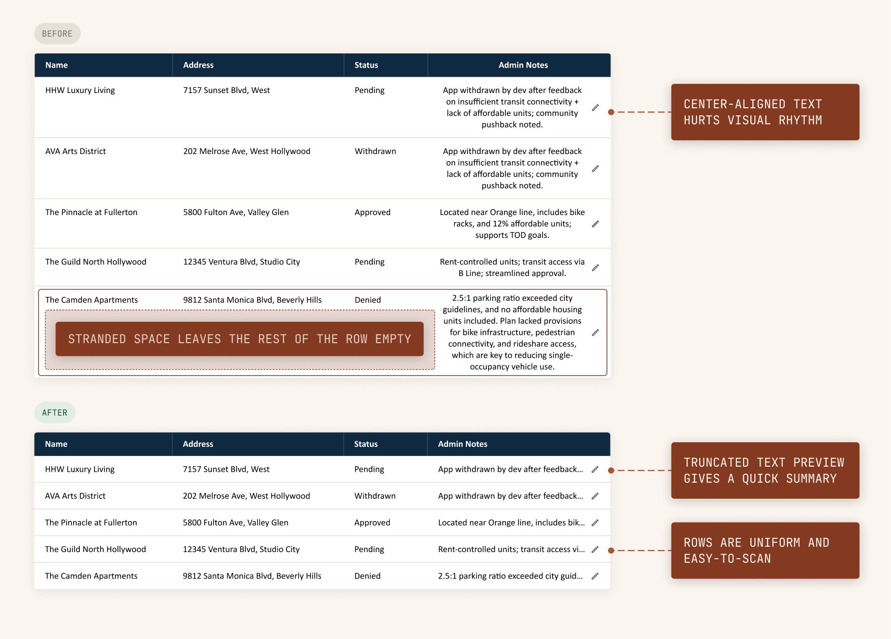
- Breaks row scanability: A full-text display with center-alignment inside the cells hurt visual rhythm, making a dense dashboard harder to scan.
I was tasked to redesign the in-line editor to be more “user-friendly”. To accomplish this, the feature needed to become more discoverable and more error-resistant, while still being compact. At 15 columns with 4 more planned, the table was already dense, so the throughline became a working dashboard to anticipate columns not yet added.
The team followed a lean UX process, with formal usability research scheduled after design. Because the problem was identified through stakeholder observations rather than primary research, I supplemented that gap with secondary sources. Developers had built the product with MUI's React library, so I worked within MUI patterns and components, referencing Material Design for design guidance, and Nielsen Norman to validate the direction in absence of user data.
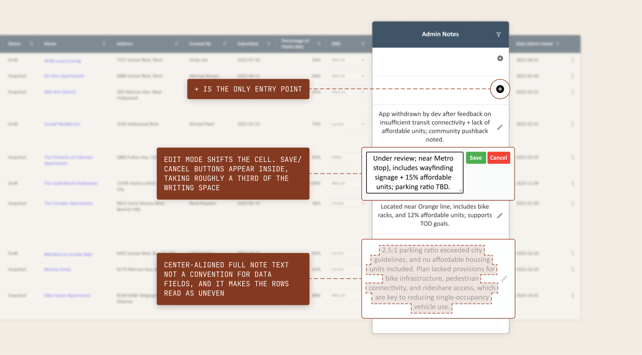
Before · Pencil-icon, in-cell editing · clicking + or pencil icon opens an editor right inside the row.
Key decision: Why a dialog
Editing moved off the table entirely, and a dialog pattern that fit the product already
The decision to move editing off the table addressed both failures, by removing the in-cell editing removed the broken visual rhythm, while giving users a dedicated working area. Referencing the existing organization’s library and Material Design’s component library, I had to decide between three options:
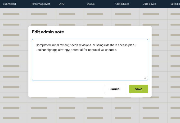
Selected
Modal dialog
Referencing MUI's patterns, I decided on this as a dedicated, focused solution without introducing a new pattern. The table stays compact, and editing gets a space of its own.
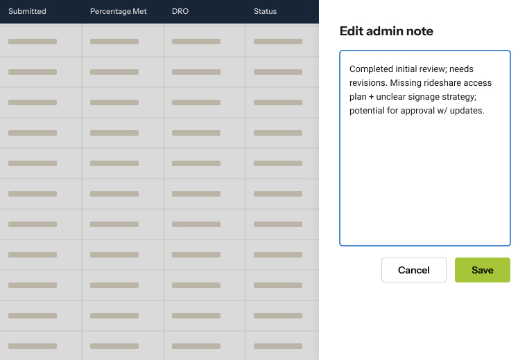
Considered
Drawer
Not common within MUI. The solution also risked introducing a new pattern the product hadn't otherwise used.
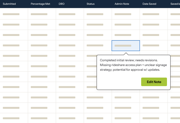
Considered
Popover
Already used elsewhere but didn't fit here. Calls for more space and a more deliberate, focused state than a popover holds.
First Iteration
A two-dialog flow that’s focused, direct, and helpful
The first iteration featured a dialog modeled on Material Design ⁽¹⁾. Since dialogs are used for high-priority items, I limited the number of features and controls to keep it minimal and direct.
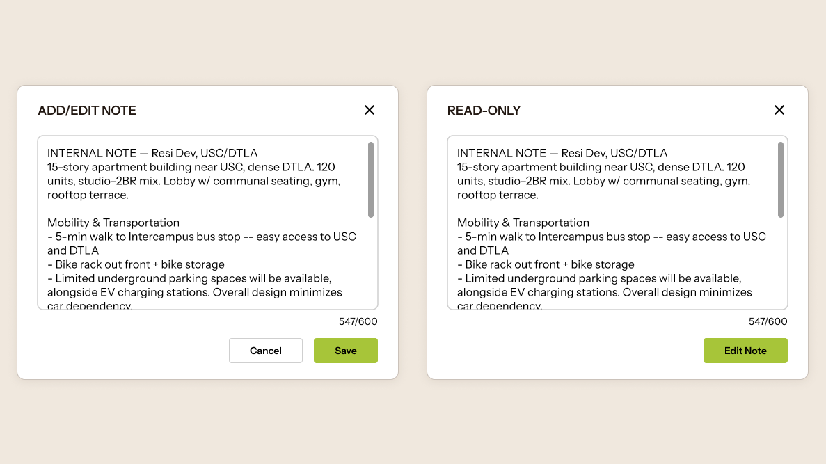
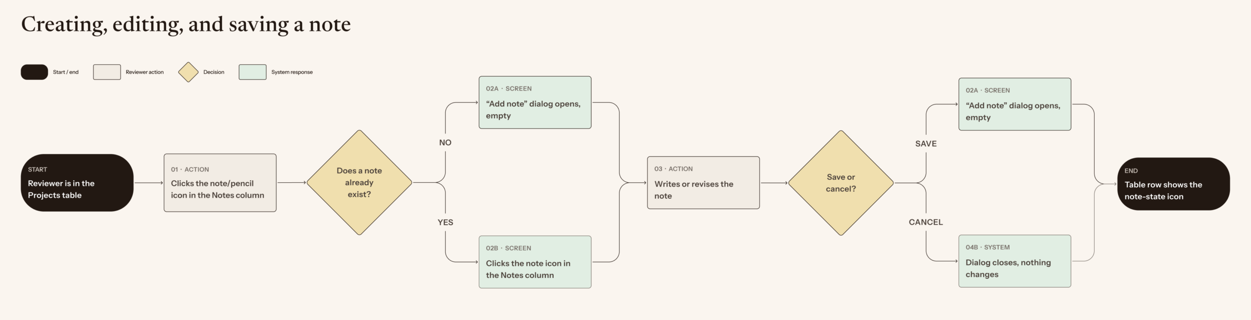
One dialog to add, the other to edit
I designed one dialog for actively writing or editing a note, and a separate read-only view for reviewing existing notes. Using MUI guidelines, I used a fixed ratio to start with the goal of maximizing usable writing space. The dialog was built on react-modal, which handles behavior but not styling, so I designed every visual property from scratch, using MUI guidelines for sizing and Hack for TDM's design library for styling. I also updated the iconography for the table's note indicator to match MUI standards.
Truncated text
On the table, I updated the center-aligned text to left-aligned to match the natural rhythm of reading left to right. I discussed with developers on how to limit the space the notes feature takes. This discussion led to the introduction of truncated text on the table, where the saved note is previewed in truncated text.
second Iteration: Stakeholder feedback
Refining the footprint and improving visual cues
We held a stakeholder review with LADOT, LACP, and Hack for LA leads, where city stakeholders requested by tightening the footprint, add rich text, and more visual cues to tell reviewers when a note is editable.
On clutter
Requests for a smaller column footprint led me to tighten the dialog layout and remove the fixed character limit in favor of a resizable text area.
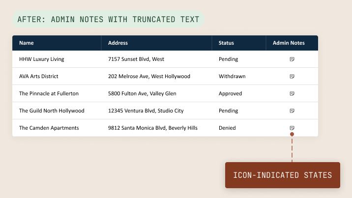
On the table, we removed the text preview and opted for dedicated notepad and pencil cons to indicate note states, maintaining a compact appearance for the additional columns already planned, bringing the table to 19 columns in width.
On discoverability & editing clarity
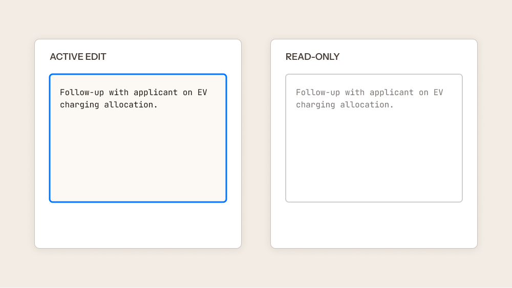
I added an HTML text editor for richer formatting and developed a set of visual cues grounded in Material Design to reduce user error and prevent accidental edits, a direct response to reviewers being unsure, in the original, whether they were in an editable state at all. This included a blue bounding box marking active edit mode, and lightening text opacity in read-only mode to signal that a note is not currently editable.
Third Iteration
Closing the error gap
The remaining piece to tackle was in building error-resistance. Because notes now lived in a dialog, navigating away mid-edit risked silently discarding a reviewer's work.
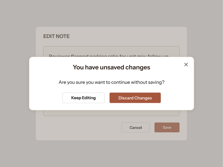
The exit-intent dialog gives clear, unambiguous actions
Exit-Intent Dialog
I introduced an exit-intent dialog that interrupts navigating from unsaved changes. Drawing on Nielsen Norman's error-prevention heuristic⁽2⁾, I included a copy that states the consequence of leaving and presented two distinct, unambiguous CTA choices.
Keeping editing inside a modal dialog, rather than in-line, also reduced the chance of data loss: a modal narrows the reviewer's focus to the single task of writing a note, which limits accidental clicks on inactive sections of the table that could interrupt the user’s workflow. This reflects established guidance that modal dialogs are appropriate when a task requires the user's undivided attention⁽¹⁾.
Implementation & impact
I handed off mockups with component-level specs and worked directly with developers on integration within the component library
Handoff included documentation of expected behavior to support implementation without requiring back-and-forth clarification. The feature was built as designed.
Adopted into the shared library
The edit dialog and the exit-intent warning dialog were both added to the product's design library during implementation, and have since been reused on other admin-facing pages, including the popover editing feature and the FAQ page. By creating designs that are aligned with the design system, other designers can now build on patterns this project established. This project was my first volunteer contribution to a shared system.
Handoff & future considerations
What I would have refined next, and the research this project moved forward without
With more time and further technical discussion with developers, I would have pushed structured interviews with stakeholders to define their specific needs for the feature, how they intended to use it day to day, and concrete examples of the kinds of notes they'd actually enter. I would have also pushed the design further by:
Refining modal behavior and adding visual cues using Material Design guidelines:
- A grey overlay to indicate hidden, continued text, so reviewers can tell when a note extends beyond the visible area.
- A subheading on the modal identifying the specific project the note belongs to, reducing ambiguity when reviewing multiple entries or switching between tasks.
Open technical questions:
- Click-outside-dialog behavior was not fully resolved and would need discussion with developers to define.
- Dynamic sizing for note width, since note content and length were left undefined, with no maximum character length ever established.
Sources
Citations
- Material Design 3, "Dialogs — Guidelines." Referenced in First iteration for dialog anatomy, sizing, and control placement. m3.material.io/components/dialogs/guidelines
- Nielsen Norman Group, "Modal & Nonmodal Dialogs: When (& When Not) to Use Them." Referenced in Resolution for guidance on when modal dialogs are appropriate for tasks requiring undivided attention. nngroup.com/articles/modal-nonmodal-dialog
- Nielsen Norman Group, "Confirmation Dialogs Can Prevent User Errors." Referenced in Resolution for guidance on when an interruption is justified to prevent loss of user work. nngroup.com/articles/confirmation-dialog
© 2026 Nami Goeku
CONTACT