PERSONAL PROJECT
Tesla Model Model 3 UI Kit in Figma
Project Summary
Project overview
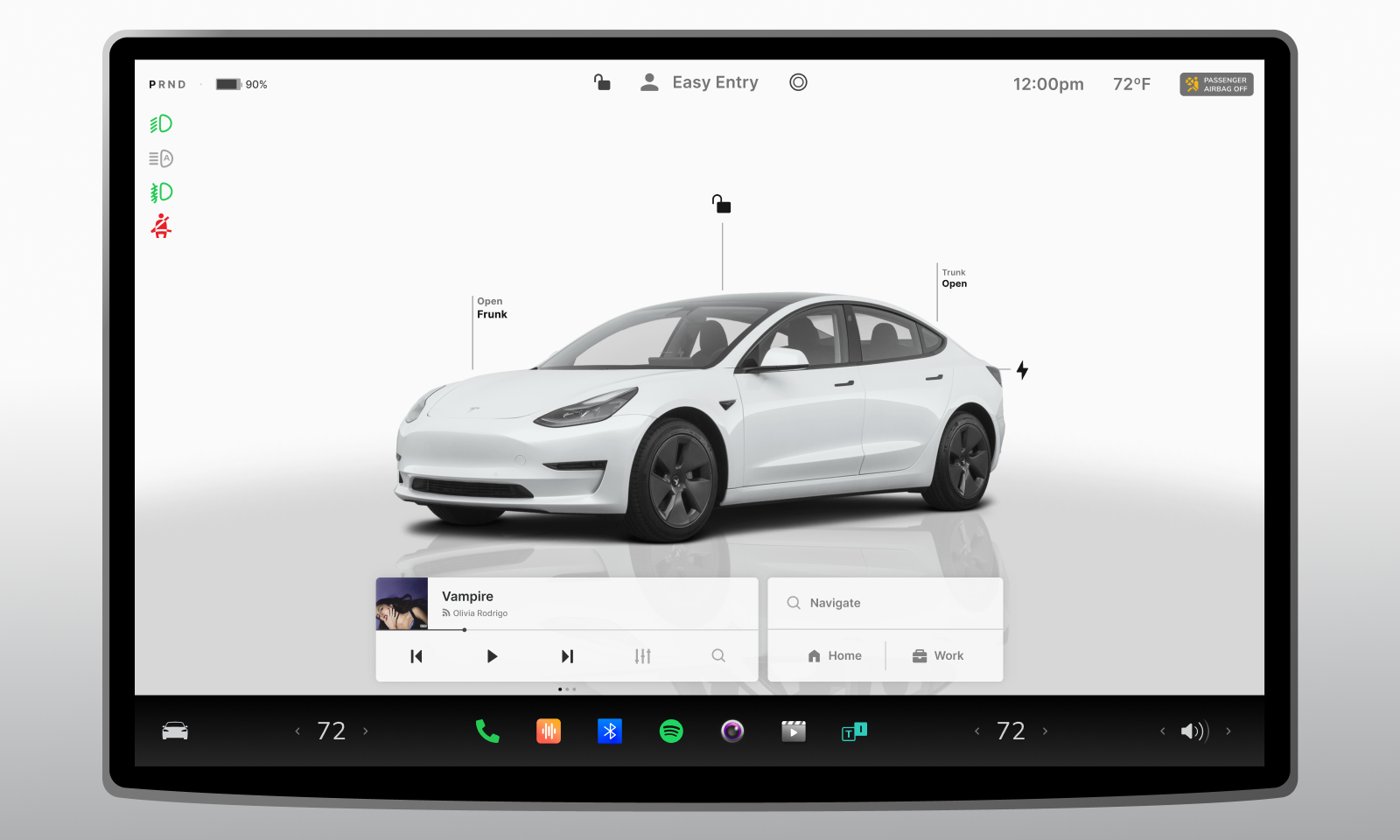
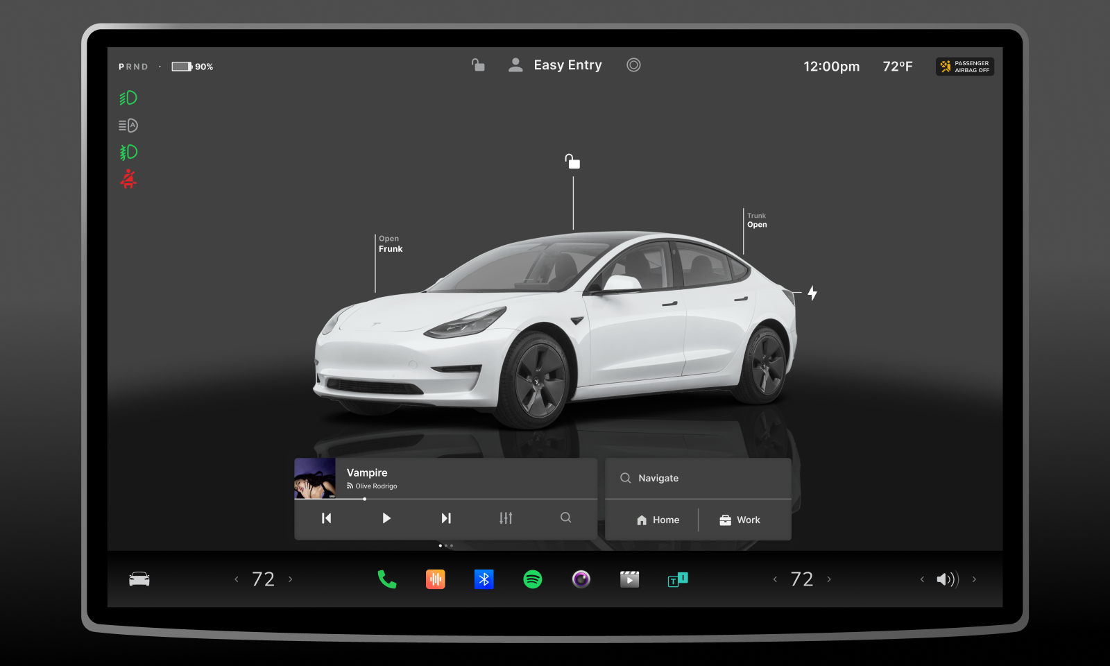
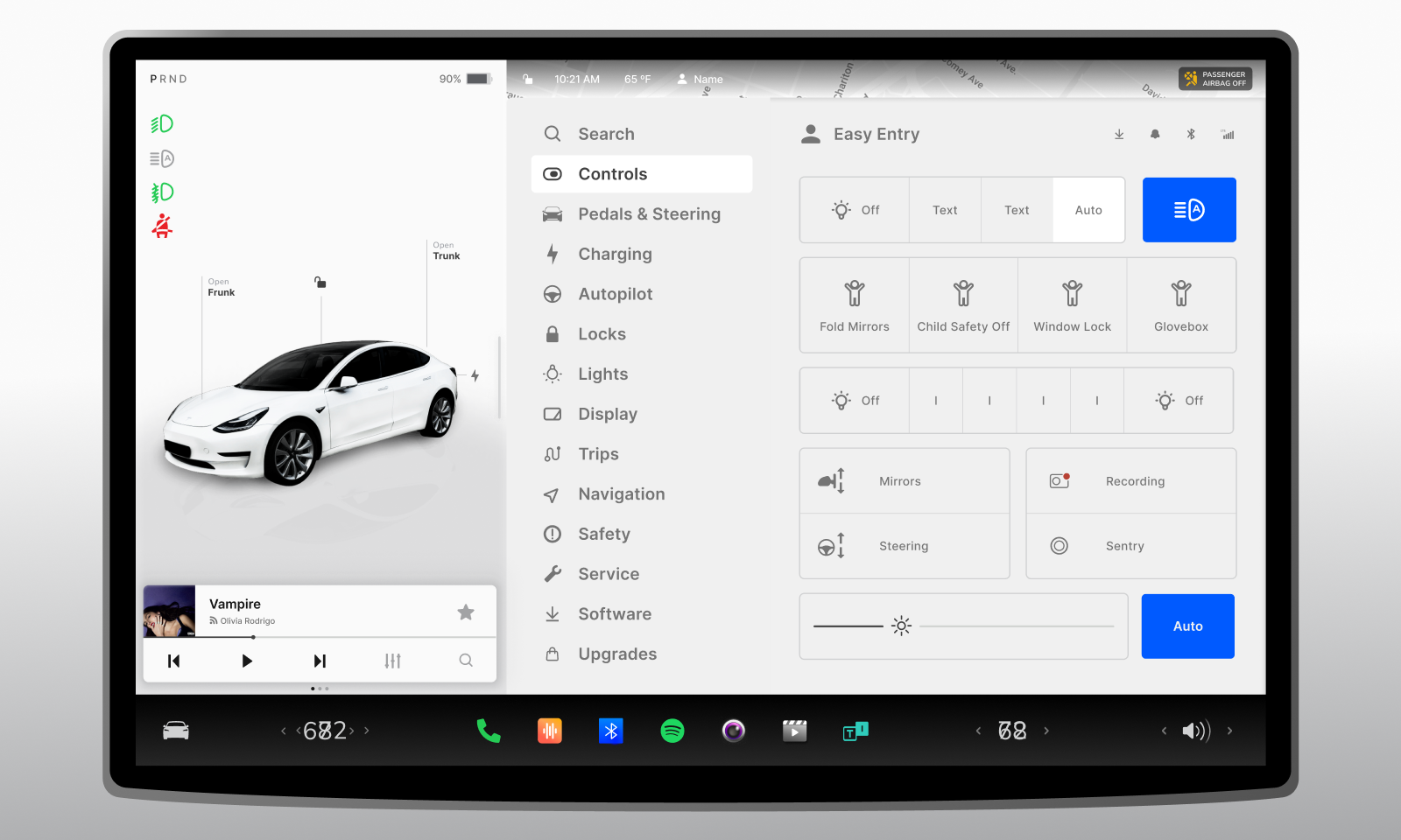
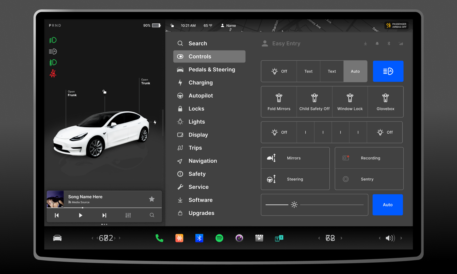
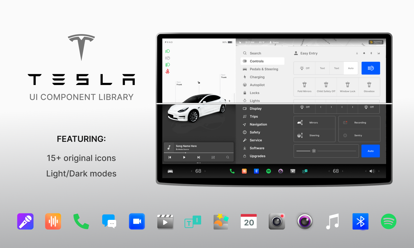
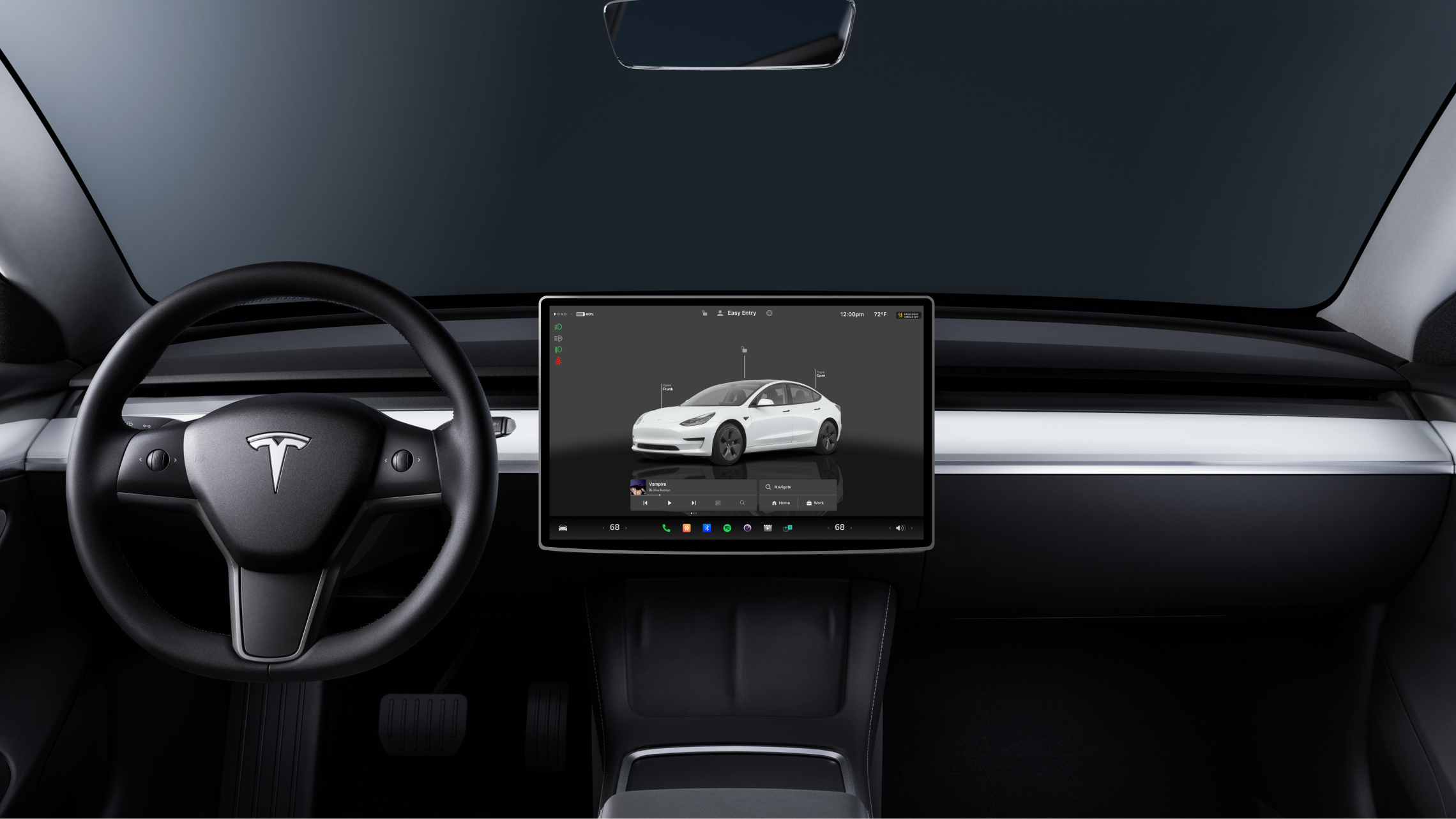
I created a UI component library that replicates the Tesla Model 3 touchscreen interface. This project was inspired by similar component libraries made by other Figma community designers. Initially a personal project, I decided to make it a public resource to assist other designers in streamlining their design processes. My component library is an updated version of previous files, organized for easy interchangeability between light and dark modes. It includes nested components, booleans, and instances, for maximum efficiency and flexibility.
Project Features
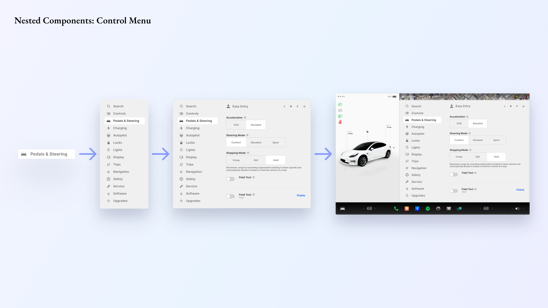
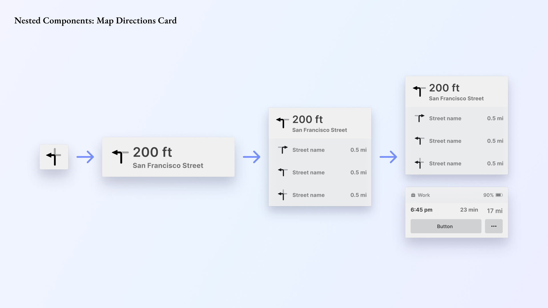
Built with Nested Components
I utilized the principles of atomic design to create nested components that can be assembled into larger components, also known as organisms. The use of nested components not only streamlines the file size but also allows users to easily customize their components for personal use.
Featuring Light and Dark Modes
The library supports both light and dark modes, providing other designers with the flexibility to easily edit and modify for their personal projects. Users can easily switch from light to dark mode.
Learning As I Go
Continuous Learning and Updates
Since publishing the file to the Figma Community in June, the file has been accessed 120 times. This experience has taught me more about how to organize files for public use, notably the importance of creating fewer frame sub-layers and following consistent naming conventions.
